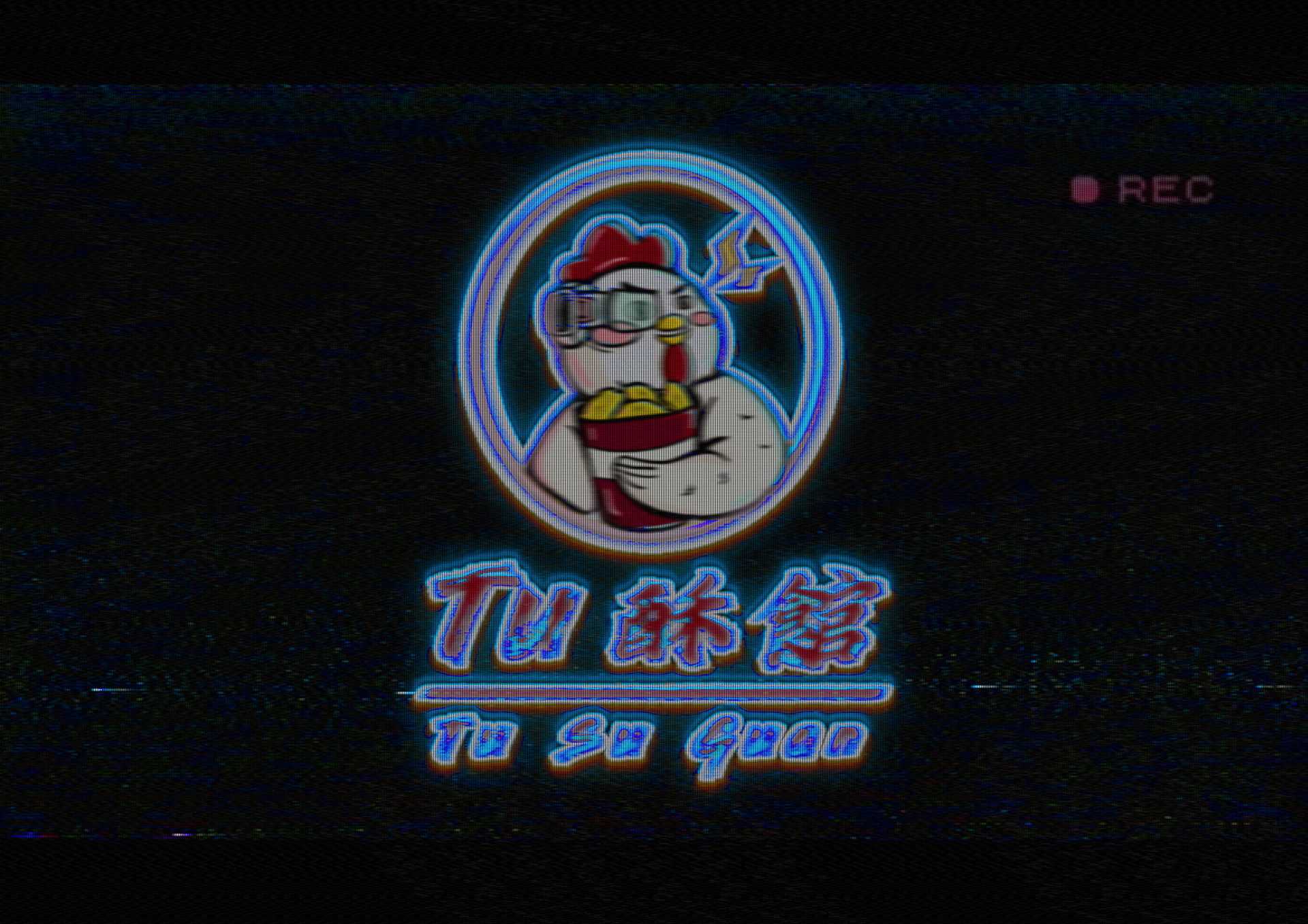
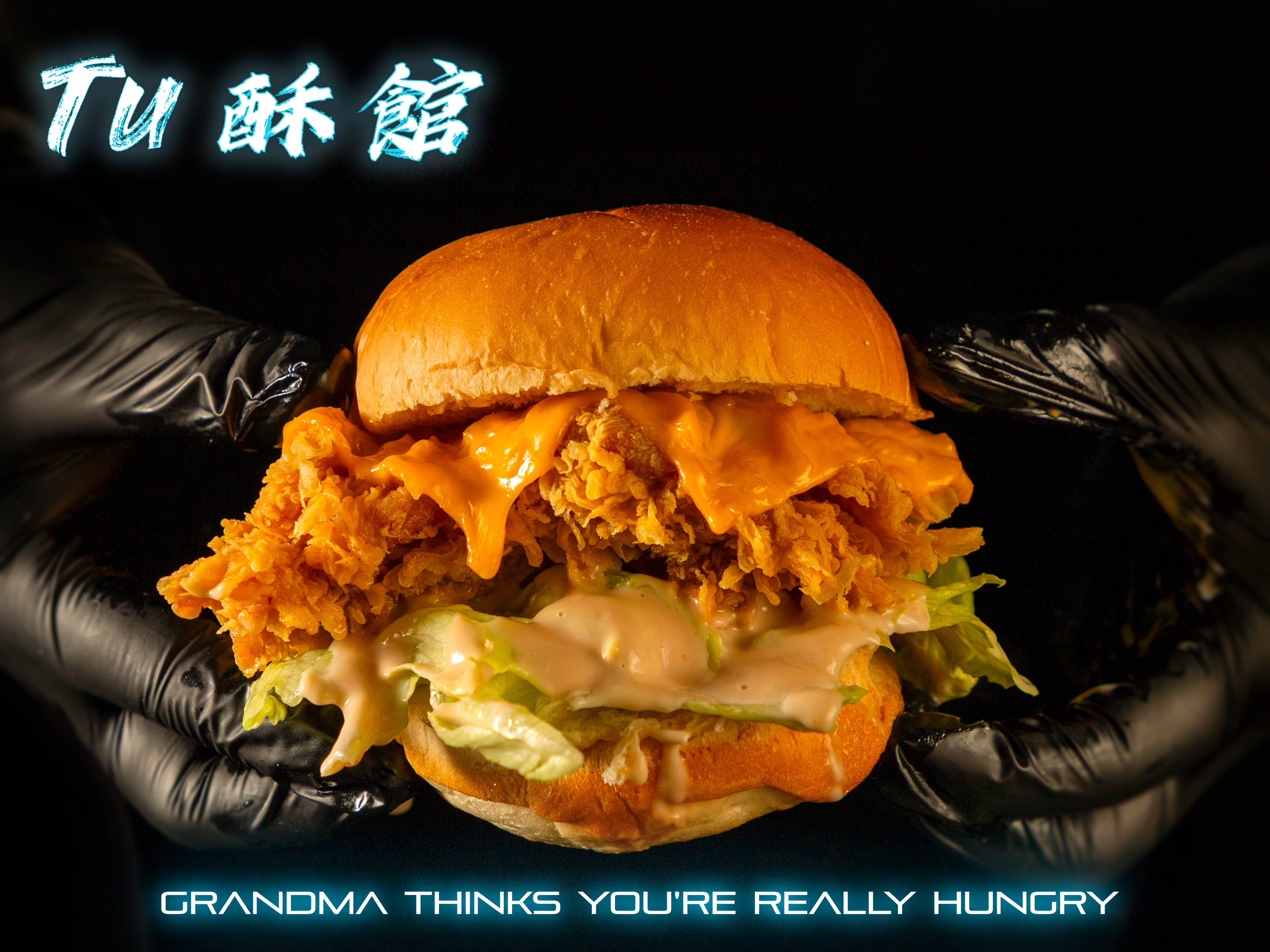
TU 酥館 - 台式炸機 (高雄鹽埕店)
- TU SU GUAN TAIWANESE FRIED CHICKEN -
DESIGNER: HSIAO YUAN KUO / TING HUANG / EUNICE CHAUNG / SHIRLEY LIU
PHOTOGRAPHER: CONSTAN LIN
ART DIRECTOR : SHIRLEY LIU
DESIGN DIRECTOR: HSIAO YUAN KUO
- TU SU GUAN TAIWANESE FRIED CHICKEN -
地點: 高雄市鹽埕區五福四路217號(駁二特區附近)
電話: 07-5217315
DESIGNER: HSIAO YUAN KUO / TING HUANG / EUNICE CHAUNG / SHIRLEY LIU
PHOTOGRAPHER: CONSTAN LIN
ART DIRECTOR : SHIRLEY LIU
DESIGN DIRECTOR: HSIAO YUAN KUO
ABOUT US
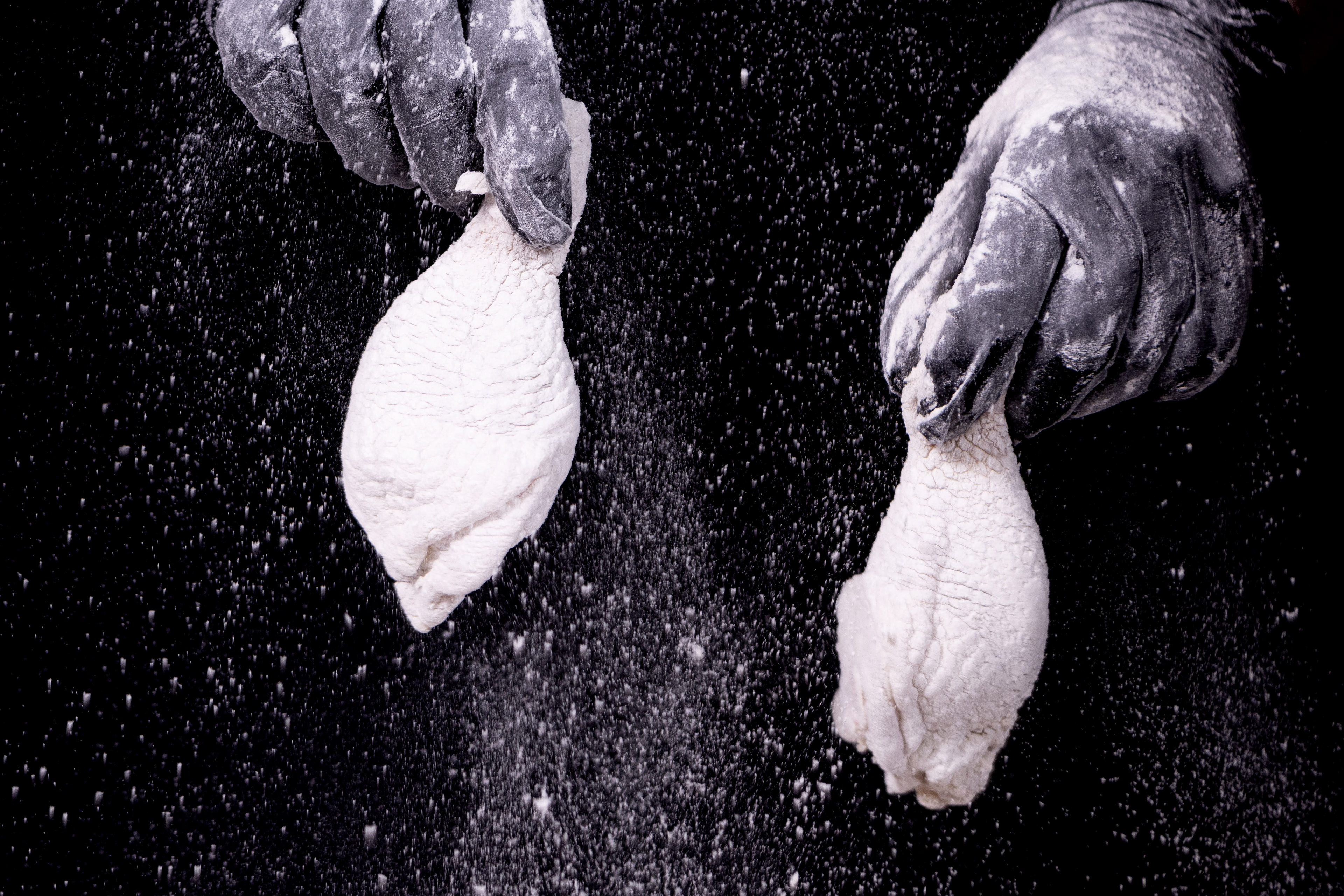
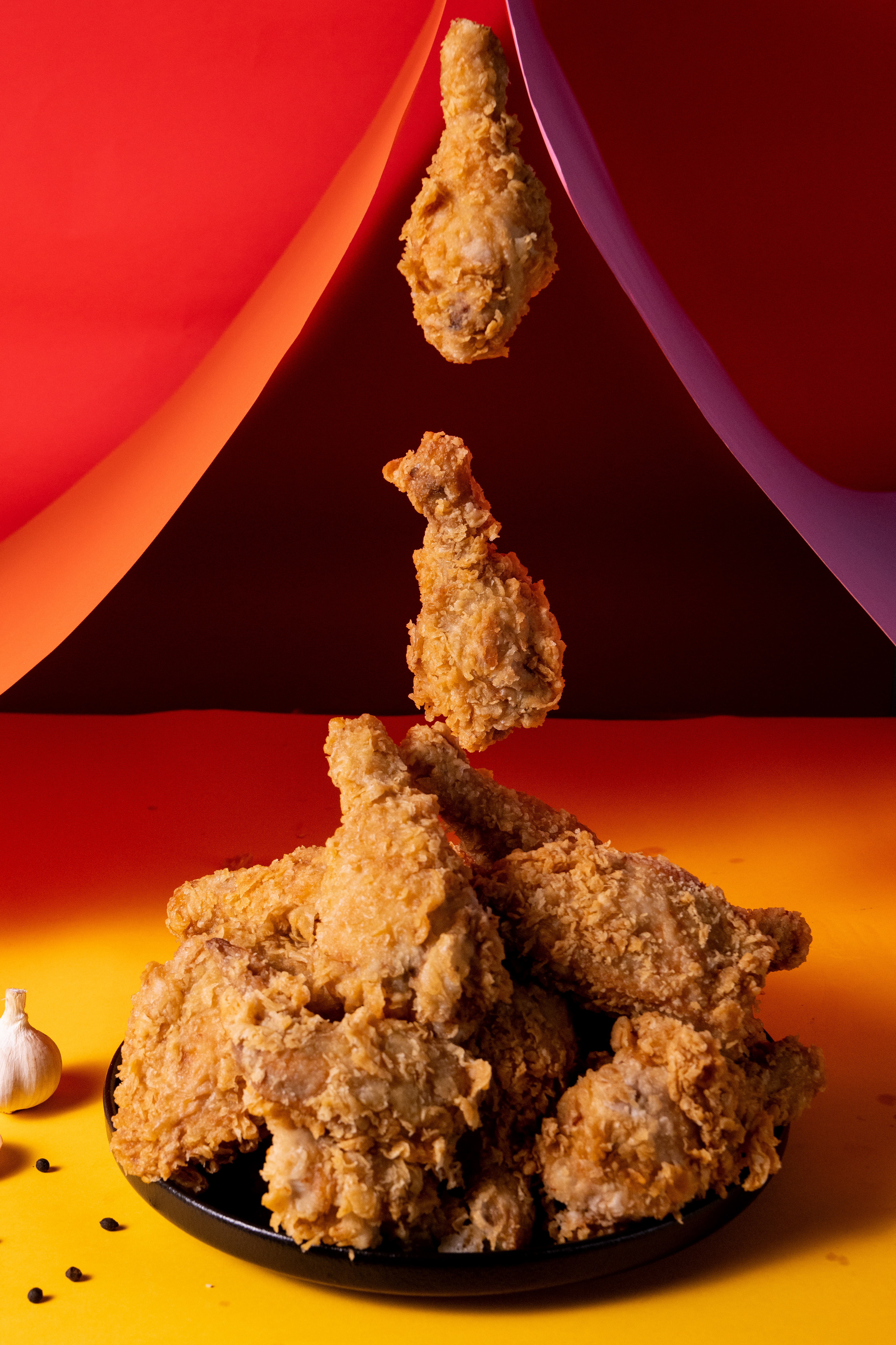
TU 酥館炸雞堅持選用台灣在地生鮮雞肉,絕不使用進口冷凍雞,讓您每一口都能嚐到鮮嫩多汁的好味道!選用國家認證的優良雞肉,經專業電宰處理,確保衛生安全,讓您吃得更安心、更放心 !
TU Crispy House is committed to using only fresh, locally sourced Taiwanese chicken—never imported frozen chicken.
This ensures that every bite is tender, juicy, and full of authentic flavor!
We select premium, government-certified chicken, processed with professional electric slaughtering techniques to guarantee hygiene and safety, so you can enjoy our fried chicken with total confidence and peace of mind!
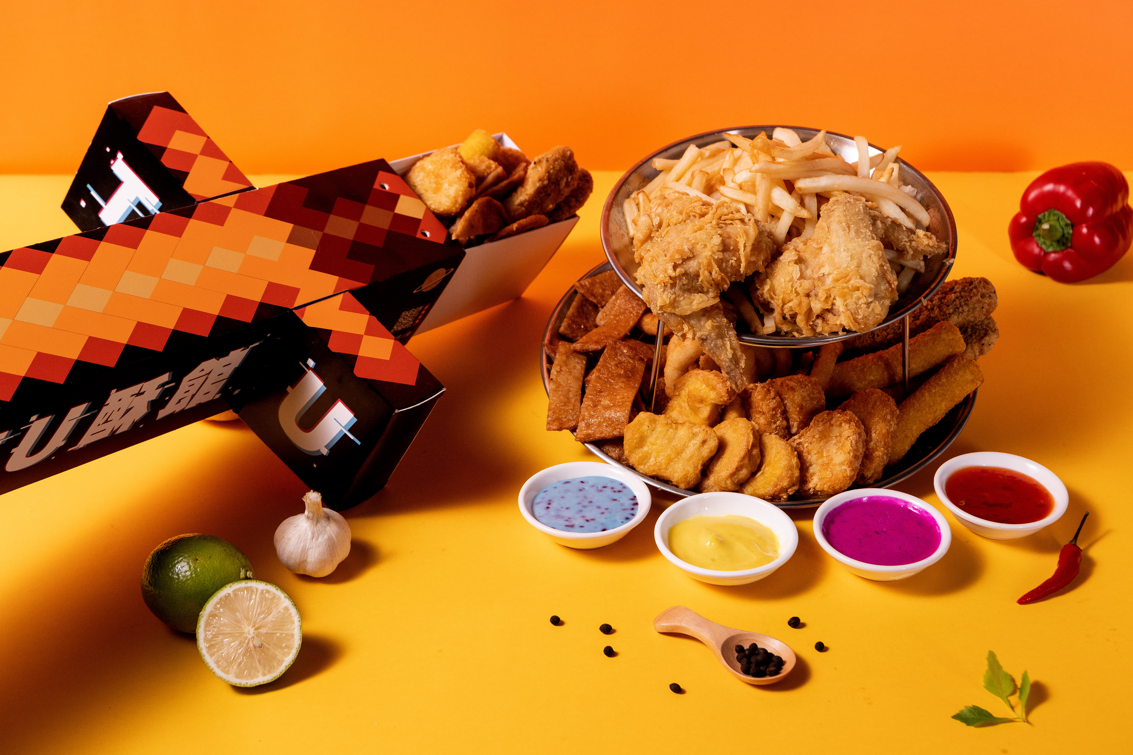
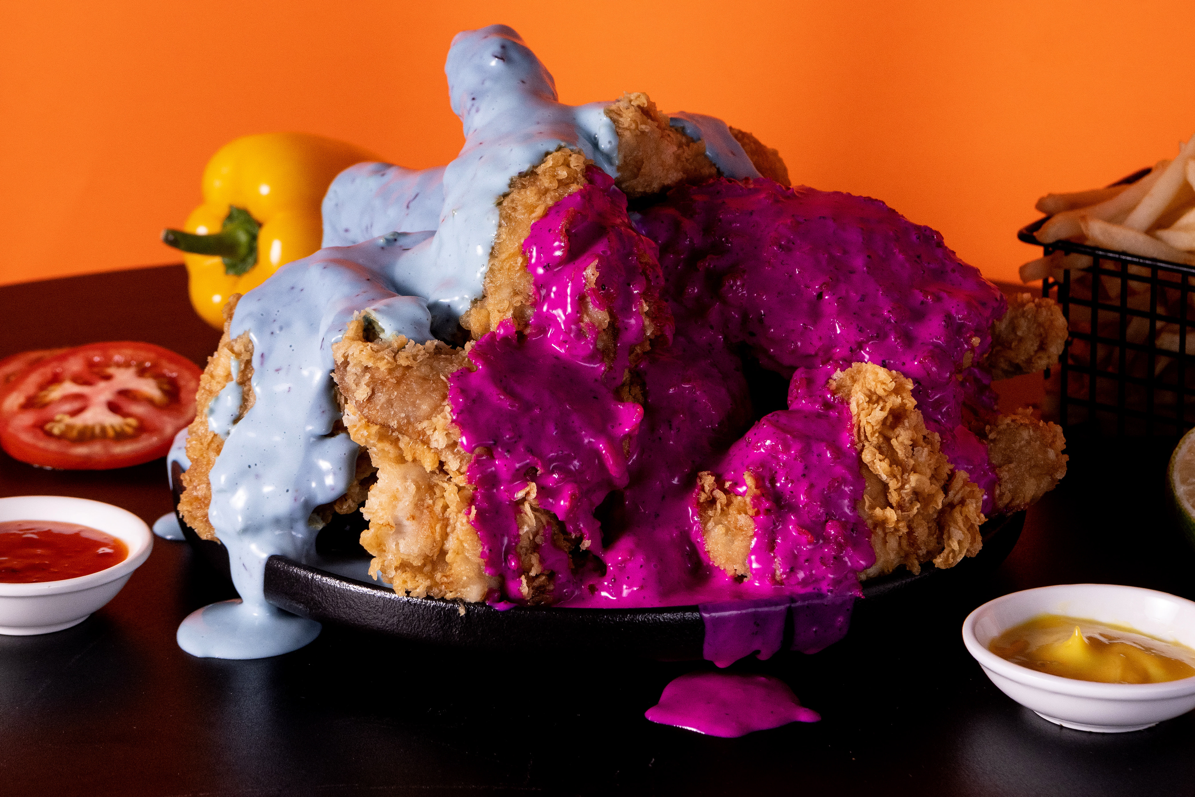
嚴選台灣在地水果醬調製: 火龍果、藍莓口味。
讓客戶在享用特製醃料製成炸雞的同時,沾上酸酸甜甜的在地水果醬,增添味蕾感官層次!
讓客戶在享用特製醃料製成炸雞的同時,沾上酸酸甜甜的在地水果醬,增添味蕾感官層次!
Carefully crafted with locally sourced Taiwanese fruit sauces: dragon fruit and blueberry flavors.
As customers indulge in our specially marinated fried chicken, they can dip it into the sweet and tangy fruit sauces, adding an extra layer of flavor to their taste experience!
BRAND DESIGN PART
/品牌故事:
前言: <當AI煮飯更勝主廚,他國美食全面取代在地食物,屬於台灣在地的味道被逐漸淡忘,你還會想念那充滿人情味又能同時感動妳的美食記憶嗎?>
在遙遠的未來,一隻名為G胖(G-PUNK)的美食監測雞,戴著能分辨在地美食真偽的能量數值眼鏡,發現了一個令人心驚肉跳的現實——台灣的炸雞文化正面臨一場由<韓雞媽>以及<翁美雞>兩個外國品牌主導的美食殖民。
: 「這不行!」G胖擔憂地整理著自己的羽毛
: 「台灣的炸雞文化不能只剩下‘台式速食’的空殼!」
於是,他決定踏上一場時空之旅,回到尚未全面被國外炸雞殖民的2024年,以一個台灣雞的身份,開創一家結合未來科技與台式風味的炸雞店——TU 酥館。
: 「將是一場美食革命」G胖自言自語,一邊調校他的時光穿梭器。
:「等著瞧,我要讓全球的人們吃著炸雞時高喊‘台雞DAMN!!!! 」
G胖的計劃可不僅僅是把炸雞做得香脆可口,還要充滿科技感。在他的店裡,他的機械手臂會為顧客炸製雞肉,而每一塊炸雞的配方都是經過科學食物量表精密計算,結合了傳統台灣香料和未來學的創新。更重要的是,所有食材都得通過G胖的能量數值眼鏡——這副眼鏡可以掃描每一樣食材,確保它們都是台灣土生土長、最上等的選擇。
因為他知道,在不久的將來,擁有CYBERPUNK風格裝潢的店面以及充滿未來創新又能感動人的台式炸雞會在社群媒體上迅速成為了一個熱門話題,廣傳千里,喚醒大家對在地品牌及美食的重視,人們會對這家結合了顛覆性科技與傳統口味的炸雞店趨之若鶩,不禁感嘆: 「原來台灣也有屬於自己的速食炸雞!」
不只傳承了台灣風味,更是在創意手法上不斷創新、前衛! 而G胖的故事更是成為了台灣家喻戶曉的傳奇。
他更夢想著有一天,TU酥館能與台積電一樣,成為國際上的台灣名片。這是一場持續進行中的美食運動,G胖正帶著他的炸雞和滿腔熱血,一步一腳印,朝著全球知名品牌邁進。
: 「未來的你們,準備好了嗎?」G胖戴著他的未來眼鏡,向著來店顧客們招手。
: 「快來TU 蘇館,品嚐來自未來的台式炸雞!」在這裡,每一個咬下都是對傳統的致敬,每一次嚼動都是對未來的探索。而這,只是故事的開始……
/Brand Story:
Prologue
When AI cooking surpasses master chefs, and foreign cuisine replaces local flavors, will you still long for the taste of home—the kind of food that carries warmth, emotions, and unforgettable memories?
In a distant future, a food-monitoring cyber-chicken named G-PUNK, equipped with energy-scanning glasses capable of distinguishing authentic local delicacies, makes a shocking discovery—Taiwan’s fried chicken culture is under siege. Two foreign fast-food giants, Han-Chi-Ma and Ong-Mi-Chi, are leading a culinary invasion, pushing Taiwan’s unique flavors to the brink of extinction.
"This is unacceptable!" G-PUNK ruffled his feathers in frustration.
"Taiwanese fried chicken cannot be reduced to a mere shell of 'Taiwanese fast food'!"
"Taiwanese fried chicken cannot be reduced to a mere shell of 'Taiwanese fast food'!"
Determined to change the course of history, he embarks on a time-traveling journey, leaping back to the year 2024—before the foreign fried chicken empire takes full control. As a proud Taiwanese chicken, he establishes a futuristic yet deeply rooted fried chicken brand: TU Crispy House.
"This will be a culinary revolution," G-PUNK muttered, adjusting the controls on his time-travel device.
"Just wait and see. Soon, people all over the world will take a bite and shout—'TAI-CHI DAMN!!!!'**"
"Just wait and see. Soon, people all over the world will take a bite and shout—'TAI-CHI DAMN!!!!'**"
But G-PUNK’s plan is more than just making deliciously crispy fried chicken—it’s about fusing technology and tradition. Inside TU Crispy House, robotic arms expertly fry each piece of chicken to golden perfection, using precision-calibrated formulas that blend classic Taiwanese spices with cutting-edge culinary science. Most importantly, every ingredient must pass the scrutiny of G-PUNK’s energy-scanning glasses, ensuring that only the finest, locally sourced Taiwanese ingredients make it into the fryer.
Soon, the Cyberpunk-styled restaurant, with its futuristic innovations and nostalgic flavors, becomes a viral sensation on social media. The buzz spreads like wildfire, reigniting a sense of pride in Taiwan’s local food scene. People flock to experience this revolutionary fusion of tradition and technology, marveling at the realization:
"Taiwan finally has its own iconic fast-food fried chicken!"
More than just preserving Taiwan’s culinary heritage, TU Crispy House dares to innovate and push the boundaries. And as G-PUNK’s legend grows, his story becomes one told in every Taiwanese household.
His ultimate dream? For TU Crispy House to stand alongside Taiwan’s tech giant TSMC as an internationally recognized symbol of Taiwanese excellence. This is not just a fried chicken brand; it’s a movement. With every crispy bite, G-PUNK is leading a flavorful revolution, one step at a time, toward global recognition.
"Are you ready for the future?" G-PUNK asks, adjusting his futuristic glasses as he greets a new wave of customers.
"Come to TU Crispy House and taste the future of Taiwanese fried chicken!"
"Come to TU Crispy House and taste the future of Taiwanese fried chicken!"
Here, every bite is a tribute to the past, and every crunch is a step toward the future. And this… is just the beginning.
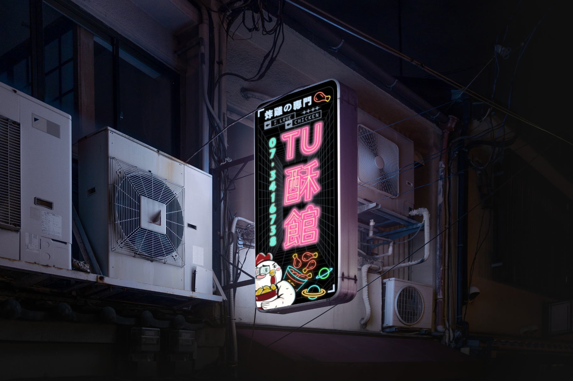
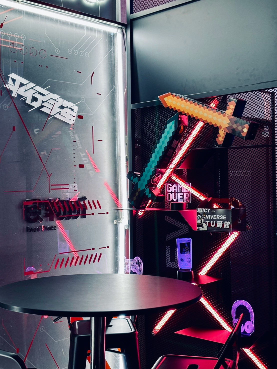
SHOP SIGN
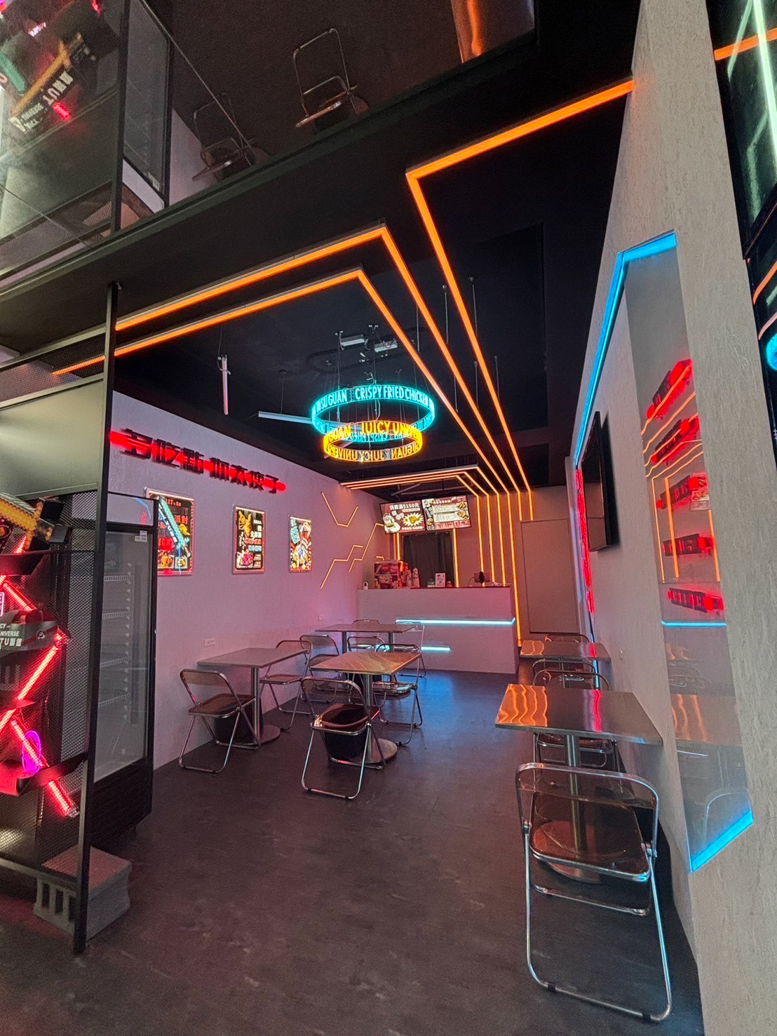
INTERIOR DESIGN
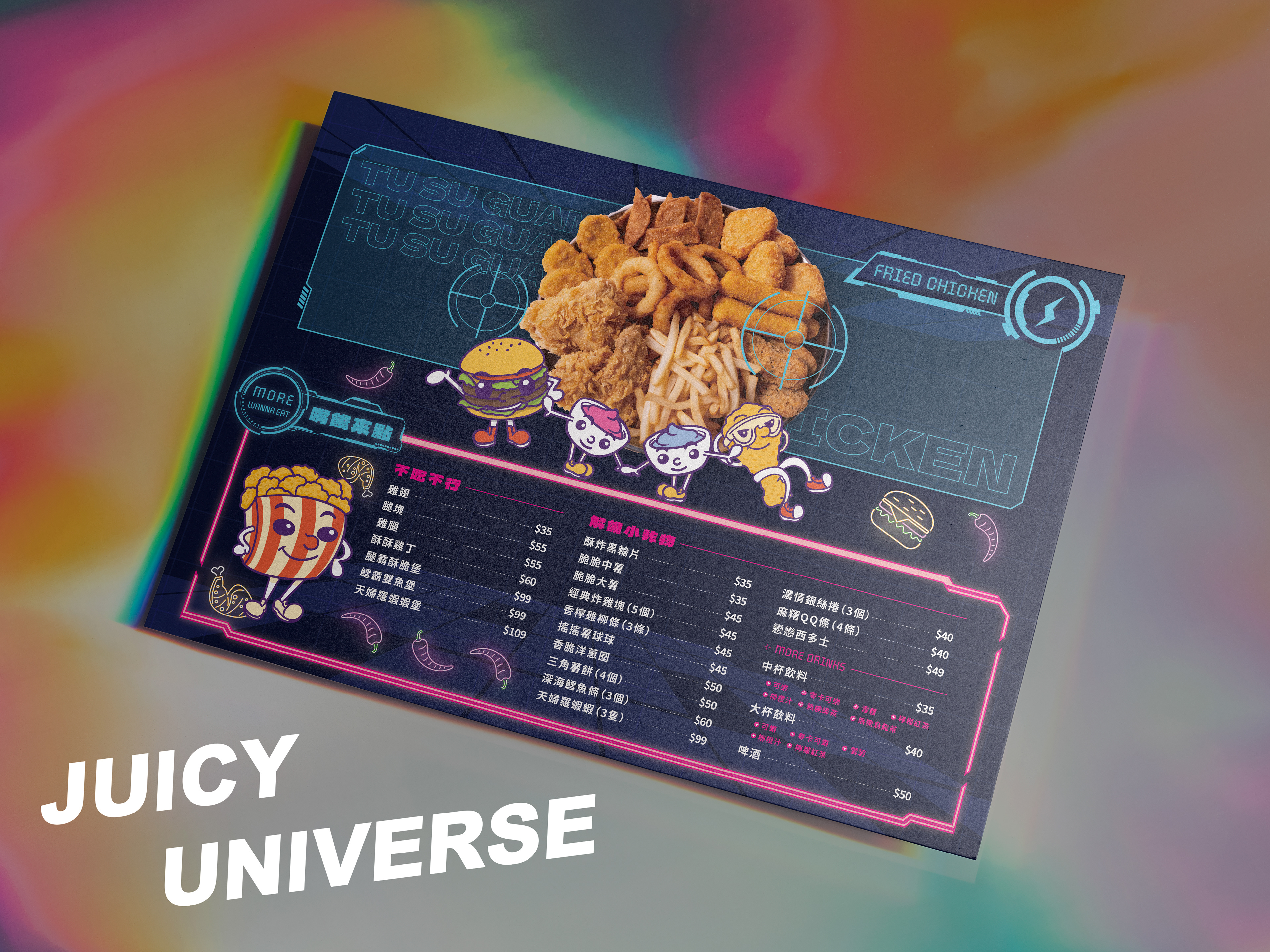
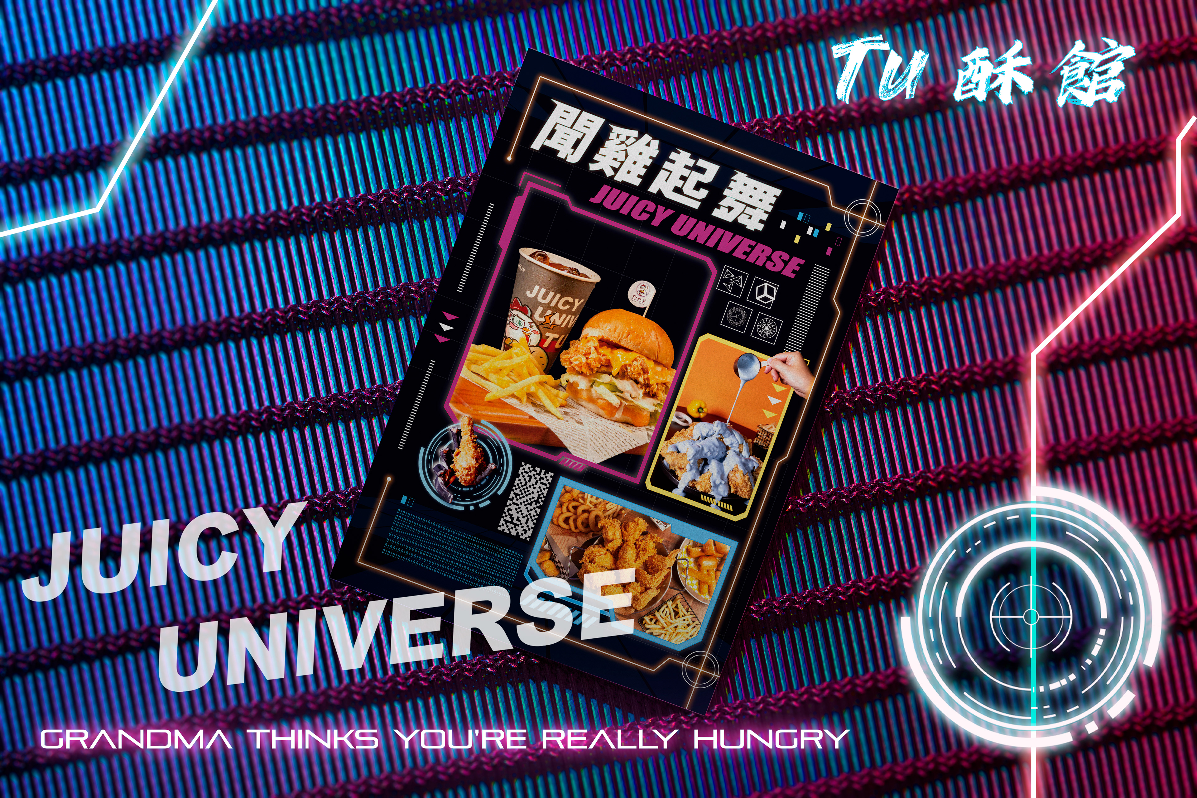
MENU DESIGN
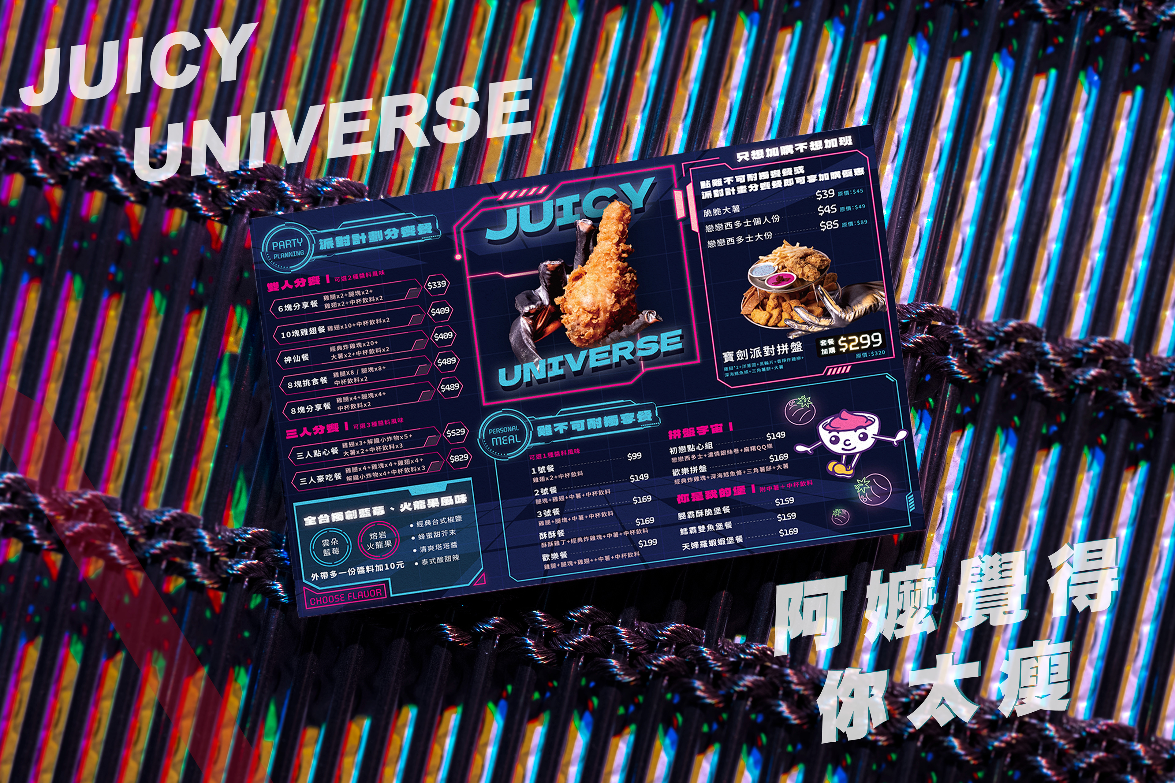
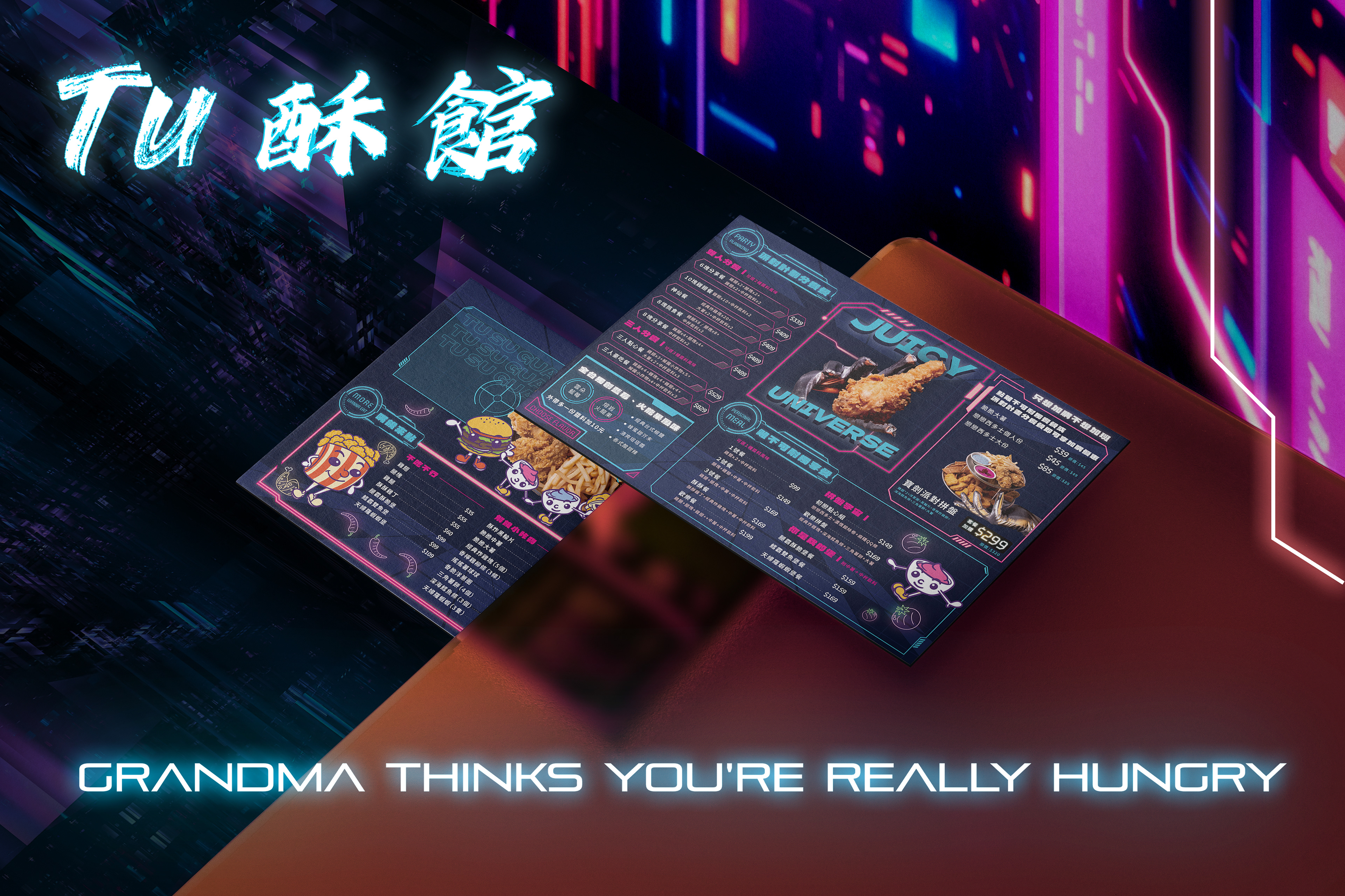
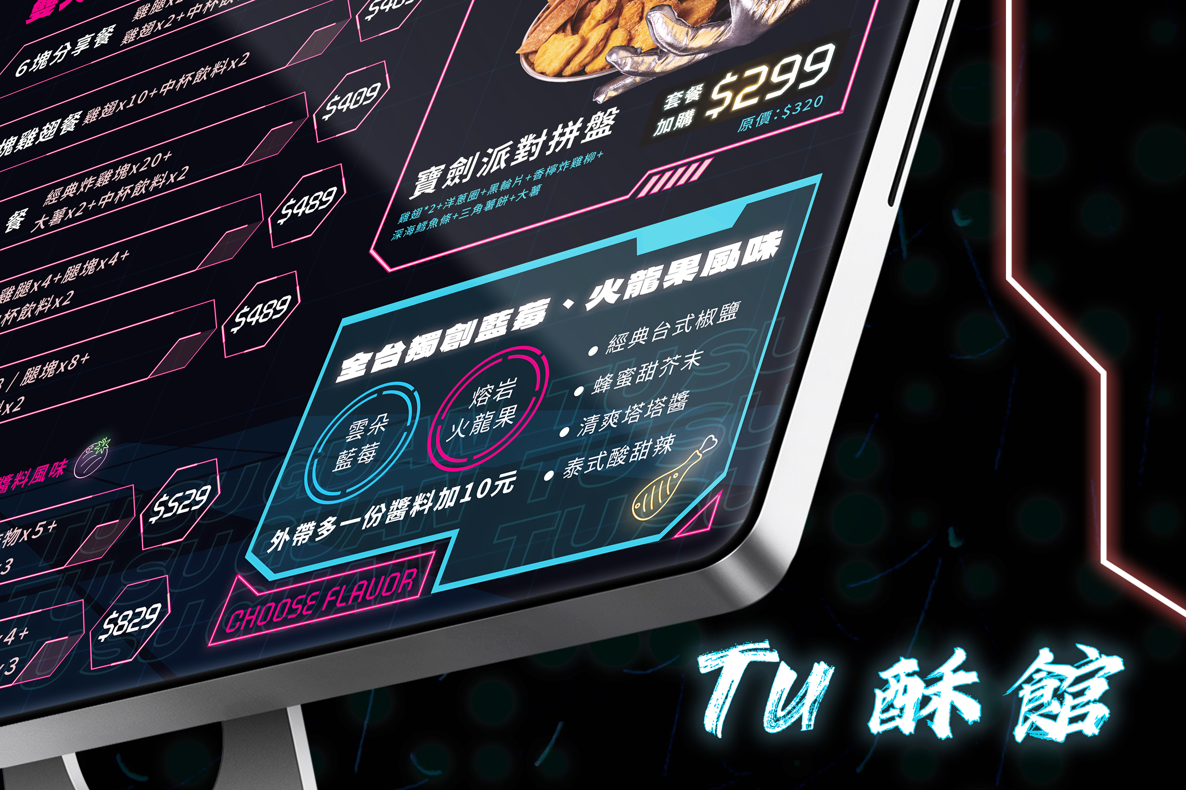
本次菜單設計以「Fast Food as Interface」為核心命題,將炸雞視為一種可被操作、被閱讀、被進入的未來系統。視覺語言大量引用 HUD 介面、數值模組與霓虹光暈線條,讓紙本菜單不再只是靜態載體,而是一張模擬未來城市中即時資訊面板的實體介面。深藍色基底象徵夜間城市與宇宙空間,承載品牌識別的藍與粉霓虹光譜,在冷冽科技感與高飽和食慾刺激之間取得精準平衡,使「未來感」不流於冰冷,而是轉化為具有溫度與能量的用餐體驗。整體版面以遊戲 UI 的邏輯進行資訊編排,透過光框、層級與視覺權重,主動引導視線聚焦於品牌最具價值的炸雞品項、特色醬料與組合選擇,讓消費者在無意識中完成理解與決策。G-PUNK 吉祥物與手繪角色作為系統中的「使用者角色」,穿梭於數據介面之中,為高度理性的資訊結構注入情感與敘事,形成一個介於快餐文化、遊戲世界與賽博城市之間的品牌宇宙。此設計嘗試重新定義菜單的角色——它不只是點餐工具,而是一個可被體驗的未來入口,將炸雞轉化為一場跨越味覺、視覺與文化想像的沉浸式互動。
This design emphasizes clarity through enhanced neon (glow) line effects, set against a titanium gray-black background infused with HUD elements and a sense of depth. It also integrates a touch of game stat aesthetics, as originally envisioned by Mr. Xu during the brand's conceptual phase. The result is a visual direction that exudes a tech-metallic feel while avoiding a cold or rigid impression.
Considering the brand's key focus on fried chicken, signature packaging, and sauces, the overall design highlights fried chicken as the visual core. In terms of color palette, besides utilizing orange, we’ve also incorporated the brand’s signature blue and pink to reinforce identity consistency and enrich the brand atmosphere.
Neon-lit sections are used to draw attention to key brand highlights and visual showcases—such as the sword meal and sauce-infused chicken—blending data-driven aesthetics and neon visuals to evoke the brand's intended ambience, simulated lighting, and layered menu-style UI effects. The goal is to guide the viewer's eye directly to what we most want them to notice.
This version continues the Cyberpunk-inspired aesthetic, but pushes further—cooler, sharper, and more sophisticated, with a stronger sense of mecha, HUD-driven game UI, and 3D futuristic visual presence.
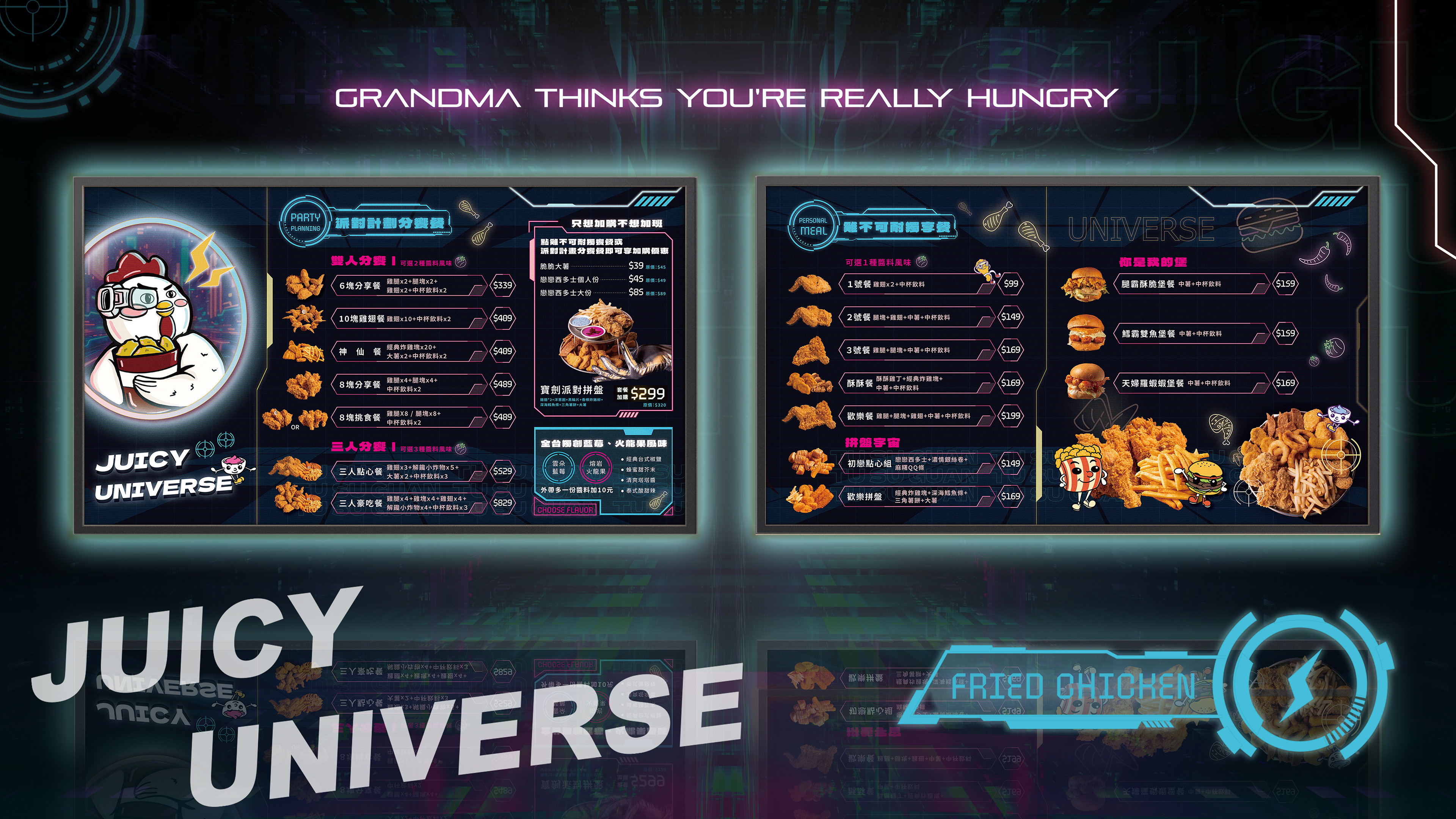
DIGITAL MENU
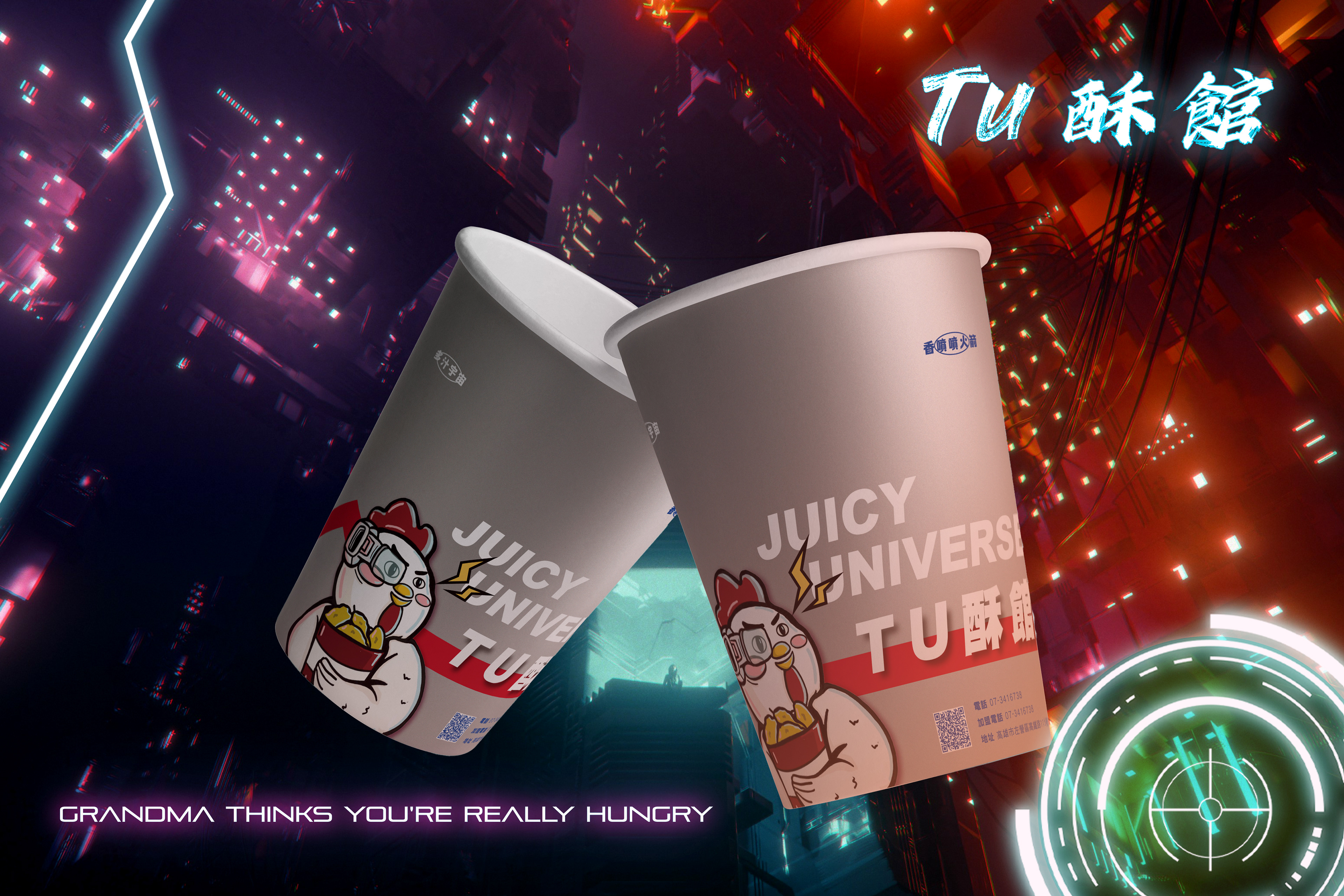
PACKAGE DESIGN
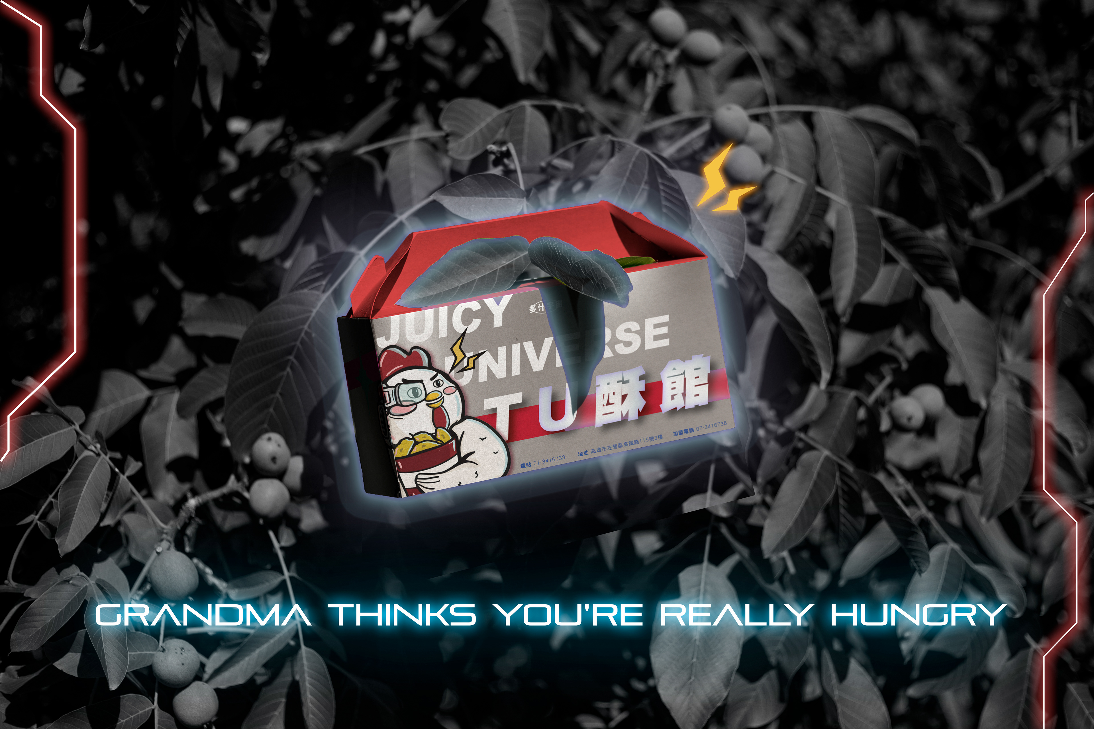

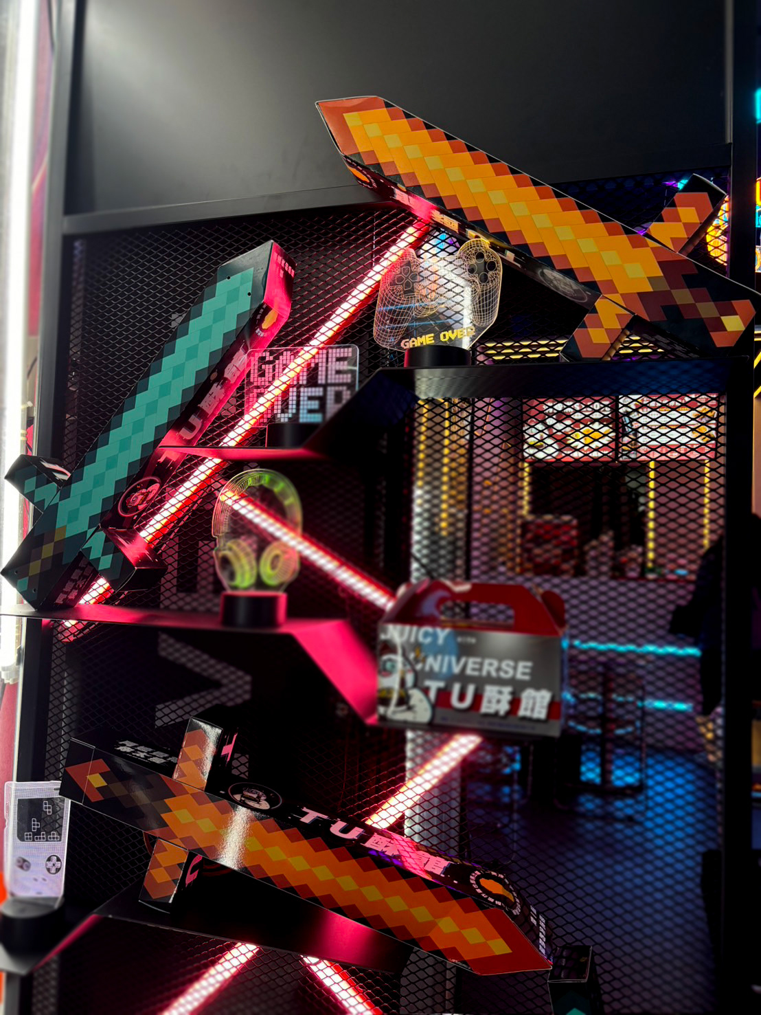
此寶劍造型是全家餐的專利包裝設計。既可以是可以玩也可以帶著走並提掛的包裝!
劍柄的地方,是店家可以放醬料或是衛生紙給客戶使用~
This sword-shaped design is a patented packaging concept for the family meal. It’s not just packaging—it’s playable, portable, and easy to carry! The hilt of the sword serves as a storage compartment where the store can place sauces or napkins for customers' convenience.
劍柄的地方,是店家可以放醬料或是衛生紙給客戶使用~
This sword-shaped design is a patented packaging concept for the family meal. It’s not just packaging—it’s playable, portable, and easy to carry! The hilt of the sword serves as a storage compartment where the store can place sauces or napkins for customers' convenience.
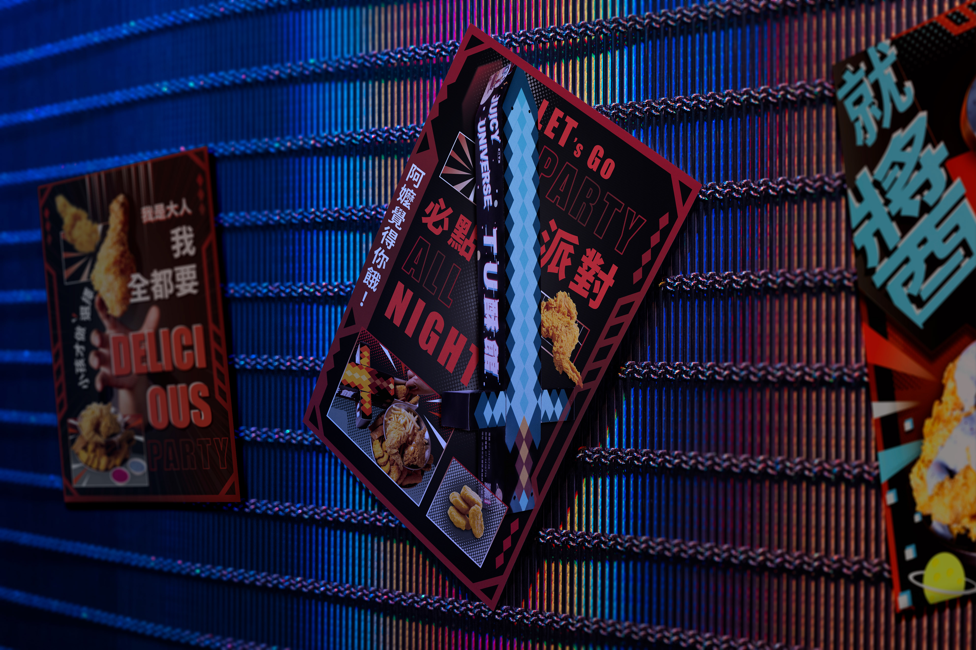
GRAPHIC DESIGN
BRAND EVENT
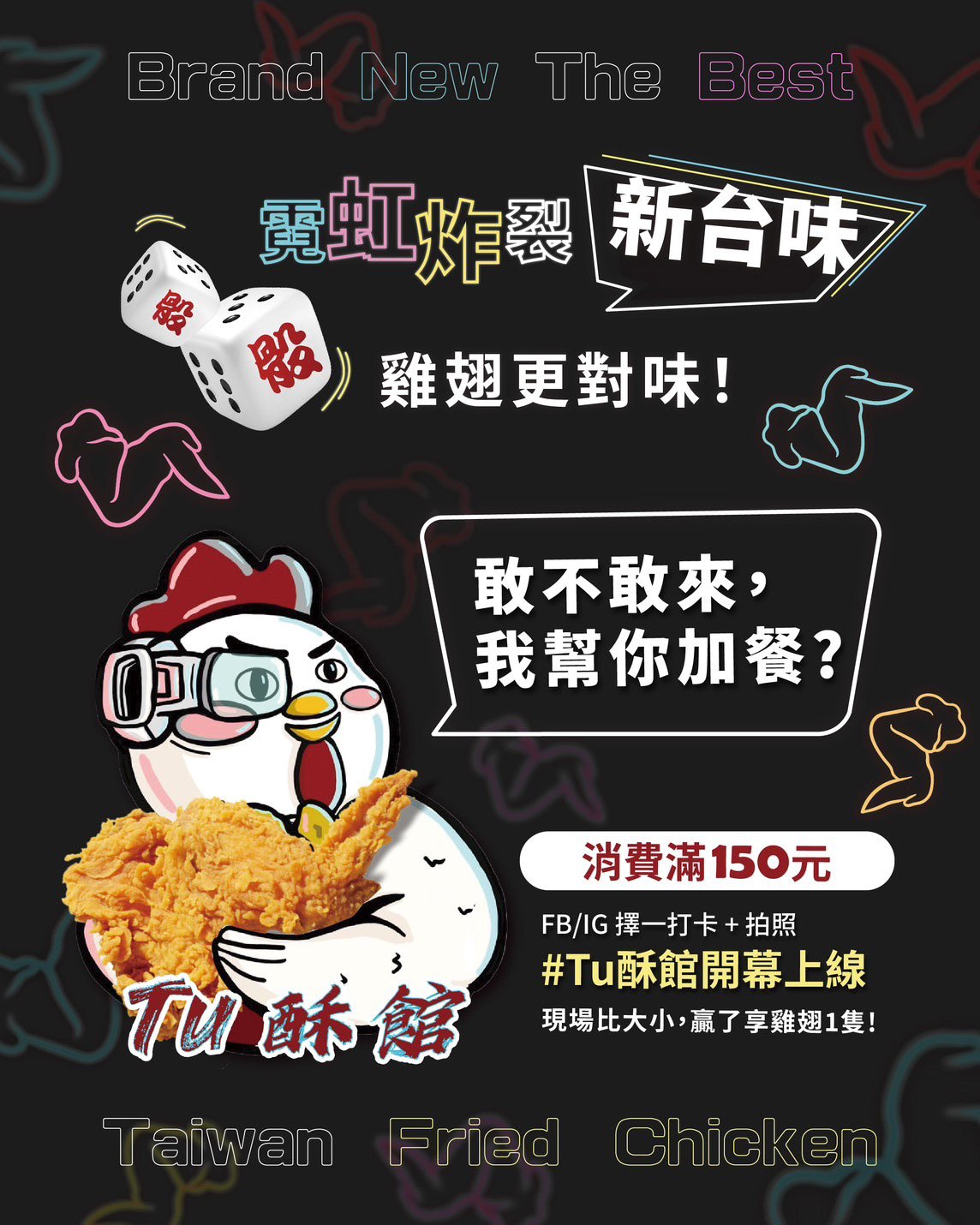
協助客戶企劃: 消費滿150元就可以與店員完擲骰子比大小遊戲,贏的可以獲得一隻免費炸雞翅!
Customer Event Planning:
Customers who spend 150 NTD or more can challenge our staff to a dice roll battle! If they win,
they get a free fried chicken wing!
they get a free fried chicken wing!
CLIENT FEEBACK
2/6開幕第一天,短短幾小時就完售,客人仍源源不斷進場詢問!
On our grand opening day, February 6th, we completely sold out within just a few hours!
Yet, customers kept pouring in, eagerly asking for more!
On our grand opening day, February 6th, we completely sold out within just a few hours!
Yet, customers kept pouring in, eagerly asking for more!
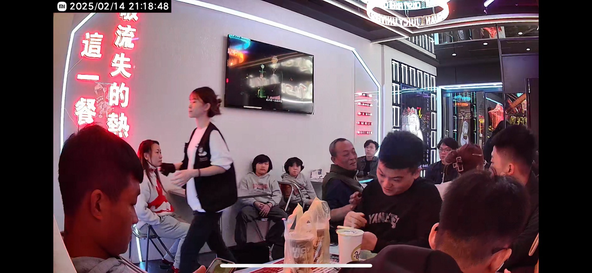
過一個禮拜仍然高朋滿座!
Even after a week, the crowds haven't stopped! The place is still packed with enthusiastic customers!
Even after a week, the crowds haven't stopped! The place is still packed with enthusiastic customers!