DESIGNER: HSIAO YUAN KUO / 郭孝淵
//CŌMICO - WHEAT CRAFT MASTERS 麥匠工藝
很感謝來自美國愛德荷州的Levis 老闆的喜愛,讓我有機會為他設計一個專門提供<麥質餐飲以及麥質廢物永續回收產品>的品牌。他們不僅所有產品取自於<麥>更是一條龍連麥廢料將它變成產品包裝的應用都能提供! 很感謝讓我有機會服務到這麼有趣的品牌!
We're very grateful to Mr. Levis from Idaho, USA, for his appreciation and for giving me the opportunity to design a brand dedicated to providing wheat-based food and beverage products as well as sustainable recycling products made from wheat by-products. Not only are all their products sourced from wheat, but they also offer a seamless approach to transforming wheat waste into product packaging solutions! I’m truly thankful for the chance to work with such an innovative and inspiring brand!
We're very grateful to Mr. Levis from Idaho, USA, for his appreciation and for giving me the opportunity to design a brand dedicated to providing wheat-based food and beverage products as well as sustainable recycling products made from wheat by-products. Not only are all their products sourced from wheat, but they also offer a seamless approach to transforming wheat waste into product packaging solutions! I’m truly thankful for the chance to work with such an innovative and inspiring brand!
設計理念:
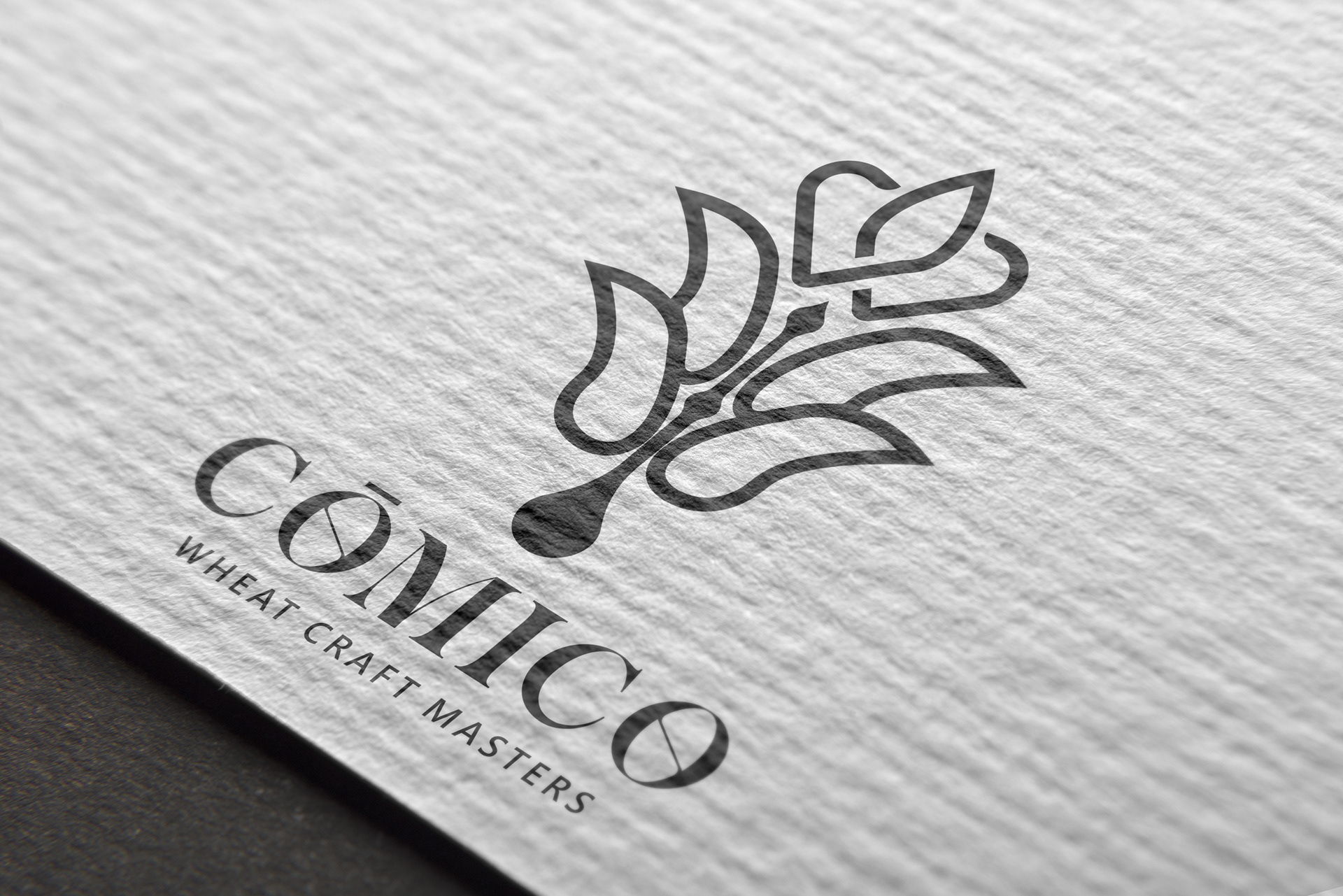
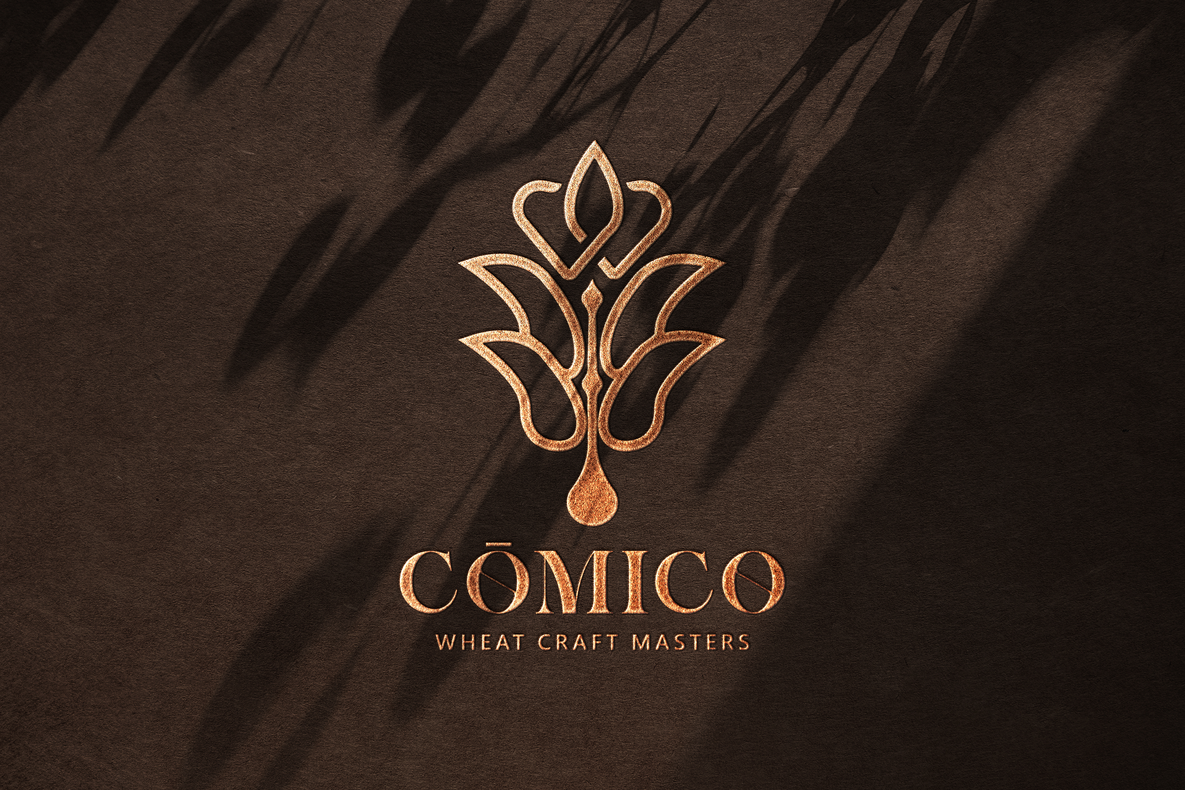
此Logo靈感源自麥穗和大麥,以現代簡約的線條設計為主,象徵著品牌對麥質原料的專注與堅持。
上方的雙愛心構成麥穗頂部,代表品牌用細心、用心和愛心去打造每一款產品,並傳達出品質放心的承諾。Logo的中間垂直部分以水滴狀的麥梗曲線設計,象徵著品牌將所有產品直接萃取自大麥的精華,展現品牌對於自然與純淨的堅持。
整體配色選用了歐美黃金麥田的大地色調,給人高級溫暖的視覺感受,同時展現了自然和質樸的質感。Slogan “Wheat Craft Masters” 明確表達出品牌是麥質產品的專家,傳遞出品牌將每一件產品視為工藝品的精緻態度,進一步彰顯品牌的專業性和可靠性。
This logo is inspired by wheat and barley, focusing on modern, minimalist lines that symbolize the brand's dedication to high-quality wheat-based ingredients. The top features two hearts forming the tip of a wheat ear, representing the brand’s commitment to creating each product with care, sincerity, and love, while conveying a promise of quality assurance.
The central vertical section of the logo uses a droplet-shaped curve resembling a wheat stalk, symbolizing the brand's practice of directly extracting the essence from barley, which reflects the brand’s commitment to nature and purity.
The overall color palette draws from the earthy tones of golden wheat fields in Western regions, providing a luxurious and warm visual experience while emphasizing a natural and authentic texture. The slogan “Wheat Craft Masters” clearly conveys that the brand is an expert in wheat-based products, reflecting its meticulous approach to treating each product as a crafted masterpiece and further emphasizing its professionalism and reliability.
PAD DESIGN
BEER PACKAGE DESIGN
