DESIGNER: SIMIK LIN / KEVIN KUO
DESIGN DIRECTOR : HSIAO YUAN KUO
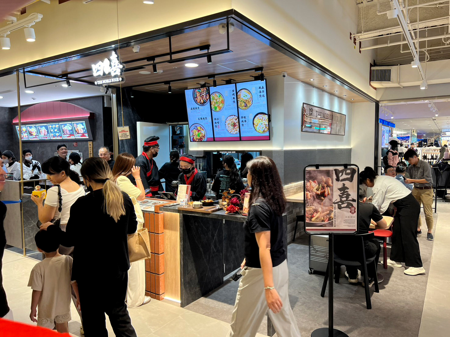
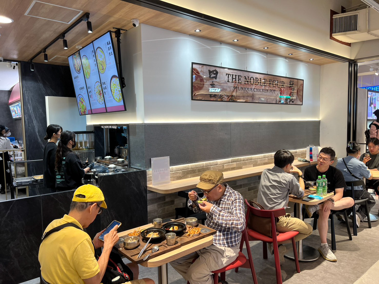
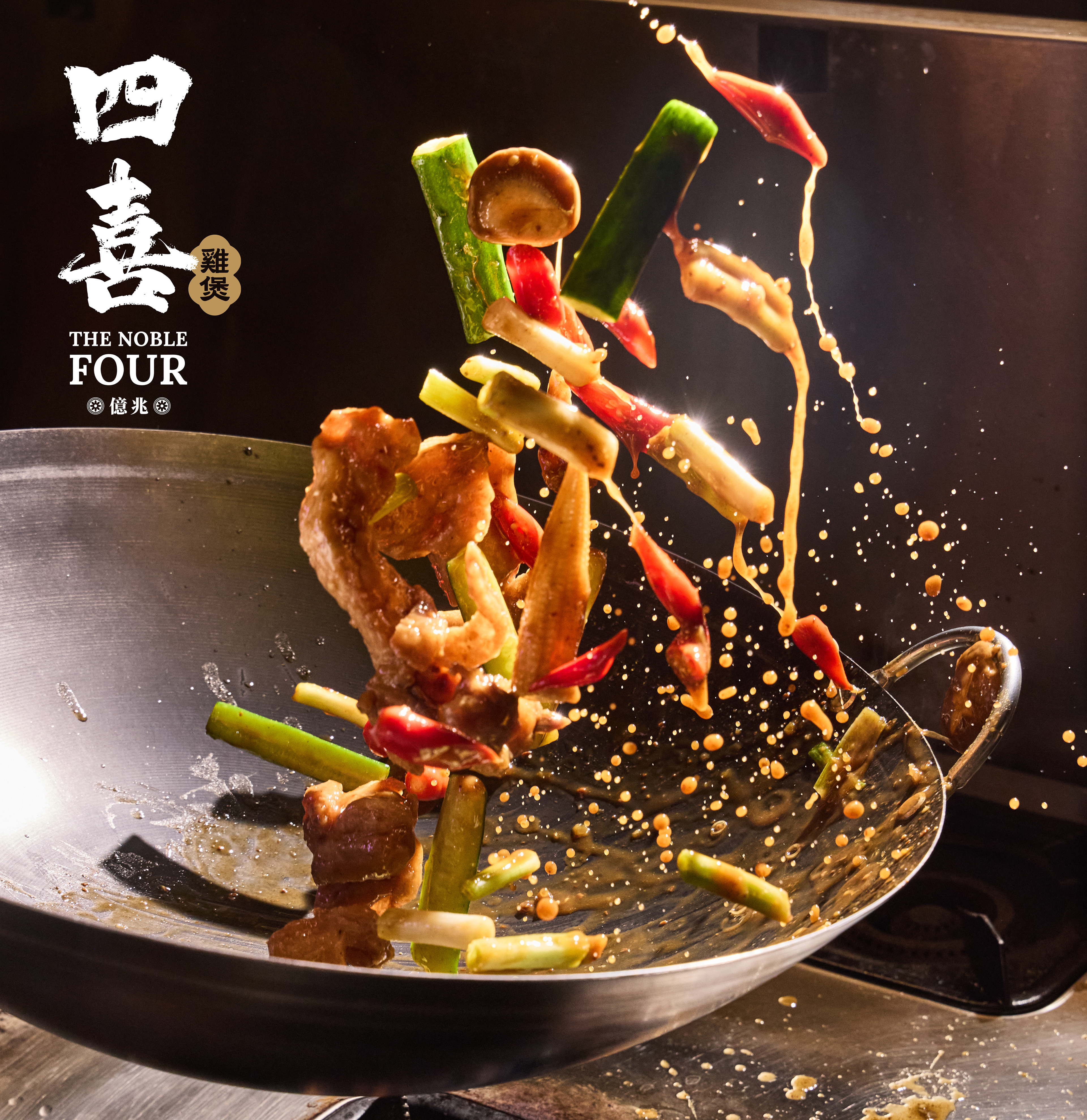
/四喜雞煲 THE FOUR NOBLE
地點 : 台中新光三越店-西屯區臺灣大道三段301號12樓
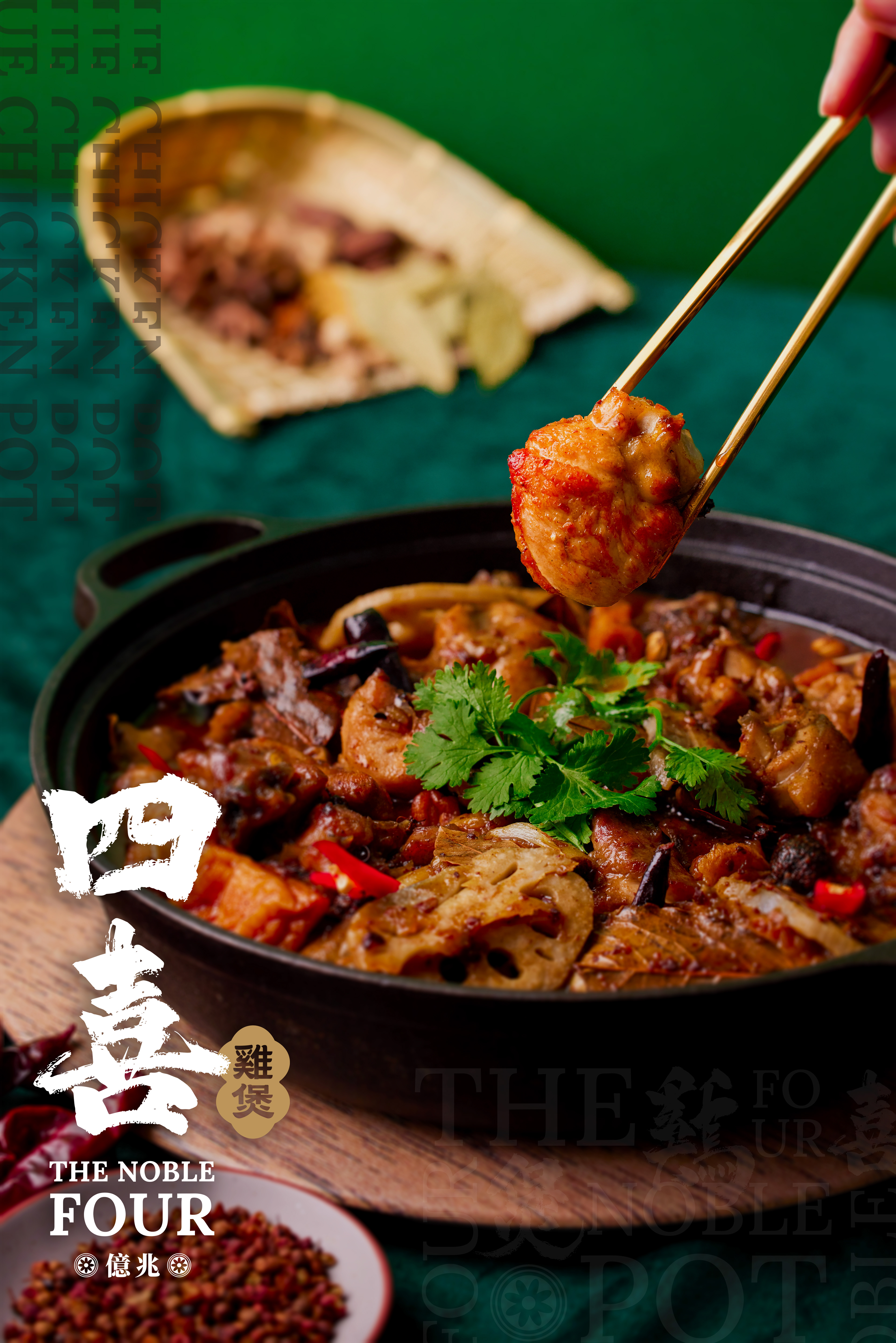
「四喜雞煲」的招牌菜《麻辣雞公煲》,每一份都 使用產地直送高品質雞肉。將多種香料按照完美 比例混合,創造出獨一無二的麻辣醬汁。在猛火 之下快速炒制,完整地保留了雞肉的原始風味並 讓香料的香氣和麻辣的滋味深入肉質,交織出令 人難以忘懷的美味。 我們對這道菜的美味有絕對的自信,相信您一旦 品嘗,將會被它獨特的味道所吸引,難以自拔。
The Noble Four’s signature dish — Spicy Chicken Pot — is made with premium, farm-fresh chicken delivered straight from the source. A secret blend of spices is crafted in perfect proportion to create a one-of-a-kind spicy sauce. Stir-fried over intense heat, it locks in the chicken’s natural tenderness while allowing the aroma and bold flavor to penetrate every bite. The result is an unforgettable harmony of heat and richness. We take great pride in this dish — one taste, and you’ll be captivated by its irresistible flavor.
The Noble Four’s signature dish — Spicy Chicken Pot — is made with premium, farm-fresh chicken delivered straight from the source. A secret blend of spices is crafted in perfect proportion to create a one-of-a-kind spicy sauce. Stir-fried over intense heat, it locks in the chicken’s natural tenderness while allowing the aroma and bold flavor to penetrate every bite. The result is an unforgettable harmony of heat and richness. We take great pride in this dish — one taste, and you’ll be captivated by its irresistible flavor.
Stephensklau - Head Chef
此為廠商原本合作設計師所提供的設計規範
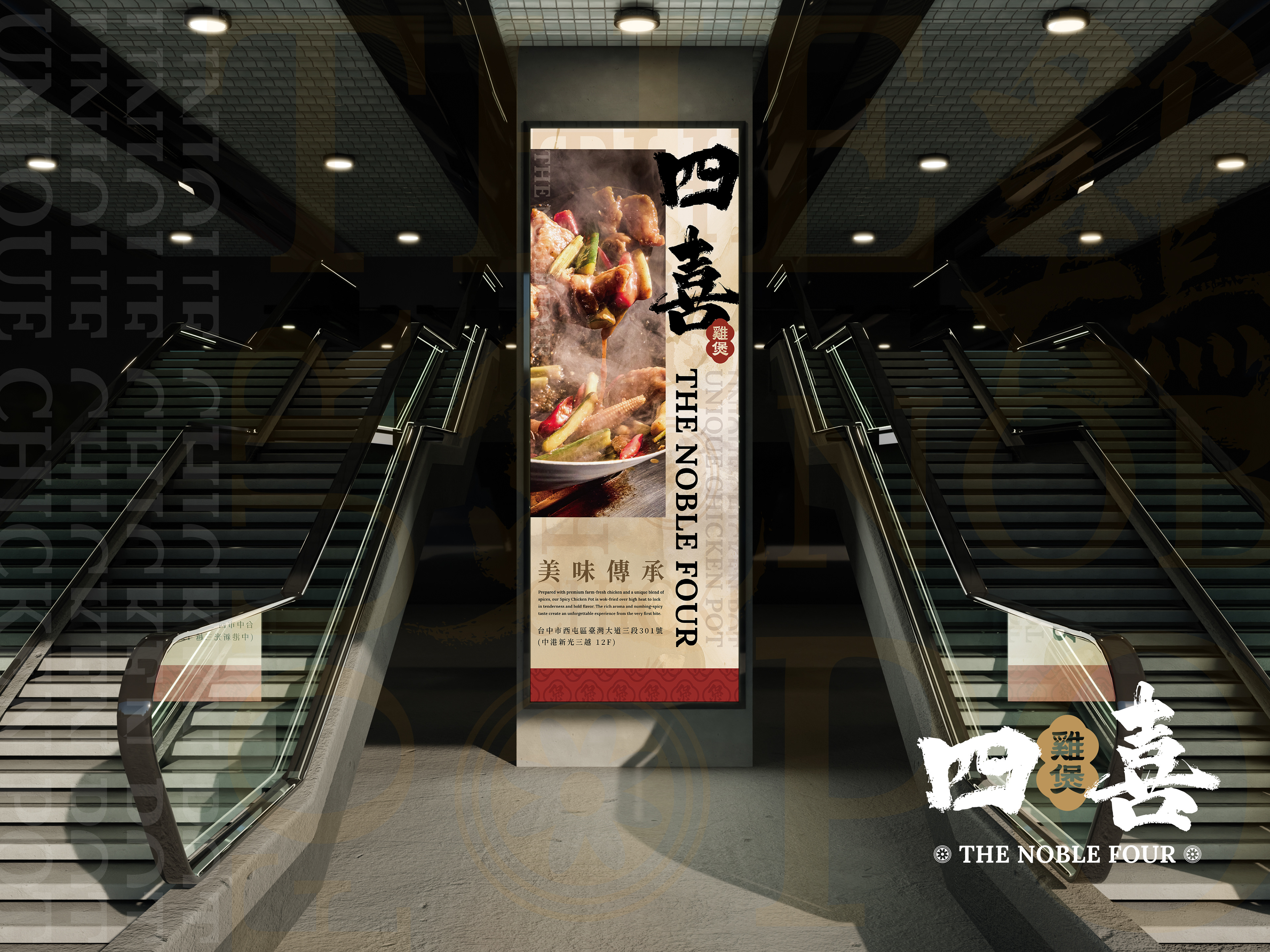
菜單設計
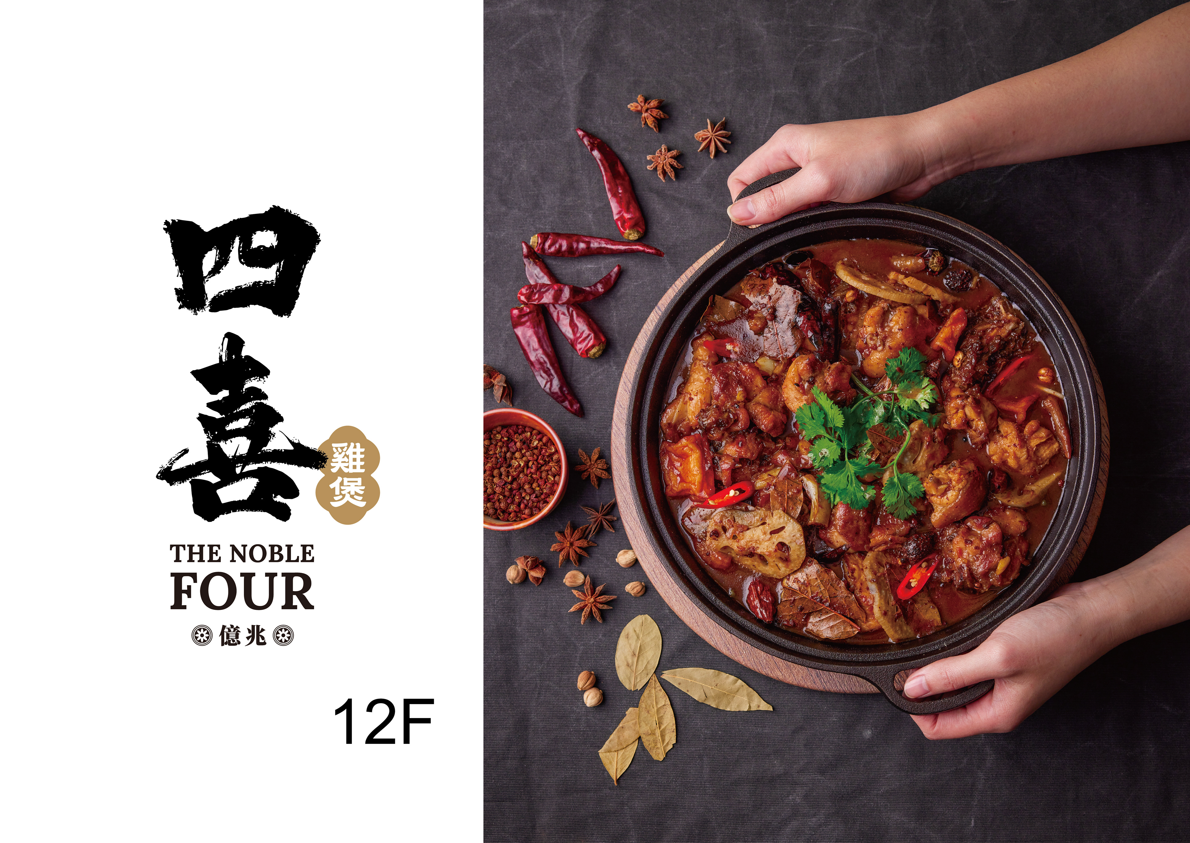
這套直式菜單以「卷軸般的節奏與器物的圓」為核心語彙:米白宣紋打底,隱約鋪陳公雞浮水印與幾何暗紋,象徵百味沉香的底蘊;主色取自新中式的「錦紅、芝麻金、鐵墨黑」,在畫面上以高低明度拉出立體層次。版面建立一條自上而下的儀式軸線:圓鍋俯拍的料理圖精準切入網格,形成「圓入方」的對話,帶出熱度、油光與食材細節;左右以細柱式欄位穿插料理筆記與風味短句,像菜根譚式旁註,讓閱讀與食慾同步升溫。
字體系統採「毛筆書寫×西文襯線×日文直排」的三語組合:菜名以奔放墨筆收尾有飛白,建立料理的武火個性;副標則以小型大寫襯線 THE NOBLE FOUR 做品牌錨點,英日標示(SPICY CHICKEN POT/麻辣チキンホットポット等)對應國際客群。功能標示以章紋化處理的金色徽章呈現「乾煲/湯煲」,佐以辣度椒符、酒香提示,價格以 NTS 輕量化數字鎖定視線落點,快速完成點餐決策。
This vertical menu draws inspiration from scroll-like rhythm and circular cookware. An ivory rice-paper texture with faint ink-wash patterns and geometric watermarks symbolizes depth and heritage. The palette—Crimson Red, Sesame Gold, Iron Black—adds refined contrast and warmth.
The layout follows a top-down ceremonial axis: circular dish images align precisely within a grid, forming a “circle-in-square” dialogue that evokes harmony and fire’s vitality. Slim side columns feature poetic notes, blending culinary philosophy with appetite.
Typography combines Chinese calligraphy, serif English, and vertical Japanese, expressing both artistry and global appeal. Dish names end with lively brushstrokes, while THE NOBLE FOUR anchors the brand. Gold-stamped icons mark Dry or Soup Pots, with pepper and wine symbols guiding flavor choice. Clean NTS numerals complete a layout that balances tradition, sophistication, and function.
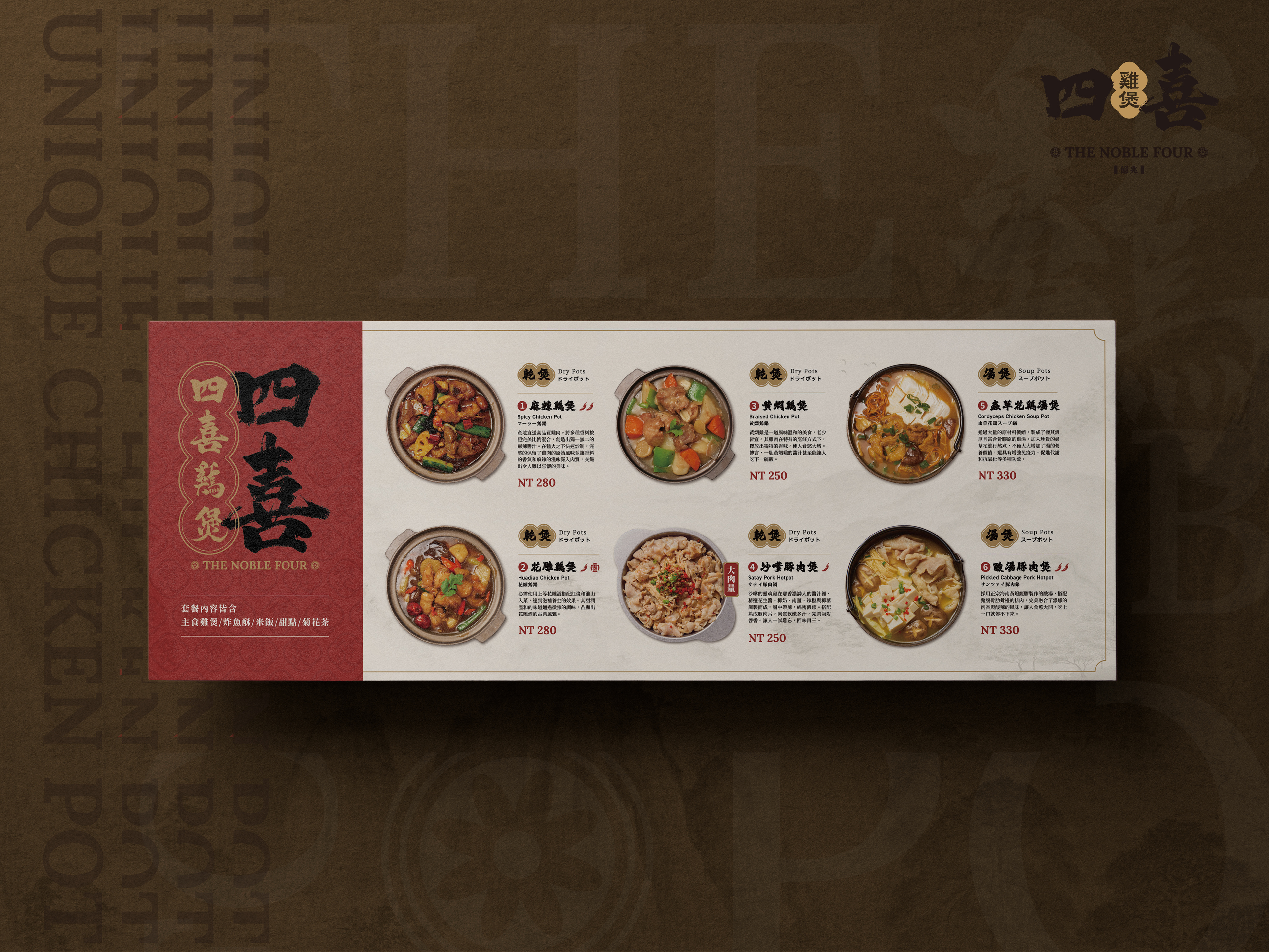
這張橫式卷軸菜單以「展卷見席」為概念:左側錦紅書脊承接品牌大字「四喜」,金框與團壽連紋做為封面式錨點;右側米白宣紙底鋪雲水肌理與淡金鎖邊,像一軸方寸山水徐徐攤開。版面以模數網格排出「乾煲→湯煲」的閱讀河道,圓鍋俯拍精準落位,形成「圓器入方格」的中式秩序。每道菜以數字圓標引導,菜名用墨筆書寫,旁列英、日雙語副標;辣度、酒香與份量改造為印章化徽記(椒符/酒印/大肉量),三秒讀懂要點。敘事節奏從①麻辣雞煲打頭陣(深色武火、油亮鍋氣)過渡到③黃燜雞煲的溫潤金調,②花雕雞煲以酒印銜接香氣記憶,最後由⑤蟲草花雞湯煲與⑥酸湯豬肉湯煲收束為清潤回甘;每道文案以「選料×火候×口感」三句式直述,將產地直送、秘製麻辣比例與猛火快炒的關鍵一語到位。底層以低不透明度散置 THE NOBLE FOUR 與家紋篆印,邊角雲頭與金線壓邊提升卷軸禮器感。整體在新中式色階(錦紅/芝麻金/鐵墨黑)與現代字體的對照中,完成「文化符號的現代表達+高識別資訊架構」:看得懂、記得住、點得快;以品牌故事為骨、器物美學為皮、商業效率為心。
This horizontal scroll menu embodies the idea of “unfolding the feast.” The left crimson spine with gold motifs anchors the brand “四喜,” while the right side opens onto ivory paper textures and gold-edged clouds, evoking refined ceremony.
A modular grid guides the flow from Dry Pots to Soup Pots, with circular dish photos precisely aligned—symbolizing “circle within square.” Each item uses ink-brush titles, bilingual subtitles, and emblem icons for spice, aroma, and portion, enabling quick visual reading.
The narrative moves from fiery Spicy Chicken Pot to mellow Braised and Cordyceps Soup Pots, each described through ingredient, technique, and flavor. Subtle seals, gold borders, and neo-Chinese hues blend tradition with modern clarity—cultural, elegant, and instantly readable.
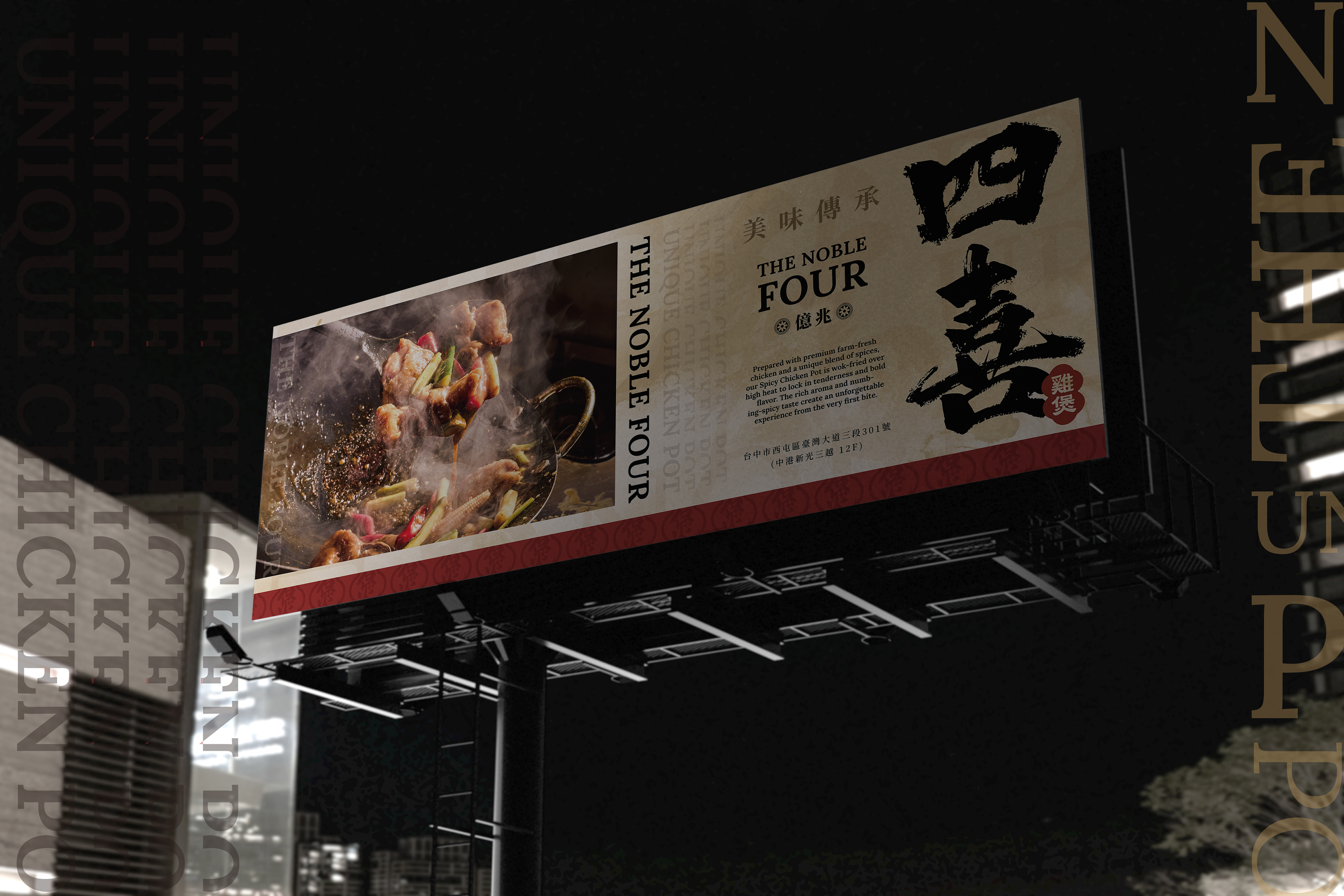
主視覺設計
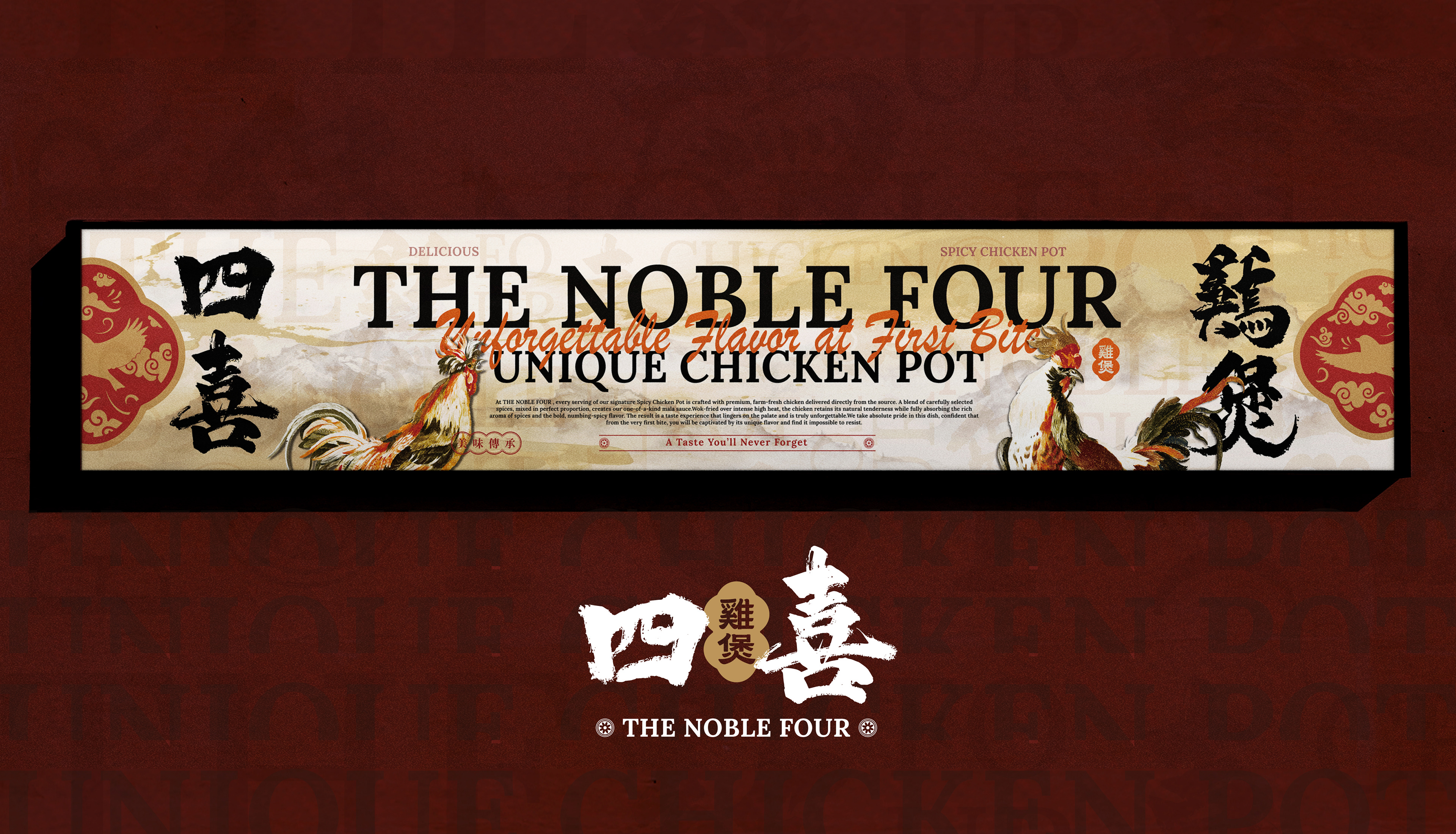
這張橫幅底層先鋪出帶水泥孔隙的灰牆質感,再以水墨山水暈染成柔霧的景深,象徵食材來自山川、火候出自人心;其上點題品牌錦紅與金砂微亮,像鍋邊火光,把視覺溫度拉高到「剛出鍋」。左右角落的傳統團壽紋與飛禽紋章以低彩度做壓底,與畫面中、英文字的薄透排列交疊,形成有呼吸的層次。
主標採「THE NOBLE FOUR」的大寫襯線字,厚重端正,建立品牌威望;上方以手寫筆觸寫下 “Unforgettable Flavor at First Bite”,讓第一口的驚喜以筆意躍然其上;下方以「UNIQUE CHICKEN POT」做結語,與中線的中英文說明條帶(「一試難忘的美味/A Taste You’ll Never Forget」)前後呼應,完成「看得懂、記得住」的國際化溝通。中上方的「美味傳承」、THE NOBLE FOUR、UNIQUE CHICKEN POT 等關鍵語則以低不透明度散佈為底紋,暗示品牌根基與獨特風味兼具——道地、卻不雷同。
視覺主角選用兩隻對看的彩墨公雞:一昂首鳴唱、一蓄勢躍步。彩墨層疊、羽色帶金,既有中式書寫的飛白,也有油彩的光澤,象徵「產地直送的好雞+猛火快炒的鍋氣」。兩雞形成視覺導線,把目光推進中心標語,再帶往右端產品訊息,與用餐動線一致。局部小標「DELICIOUS」「SPICY CHICKEN POT」與中文字「美味傳承」穿插為節拍;而「四/喜」兩字以墨色飛白重落,對照「一試難忘的美味」的語意雙關(四/試),將記憶點落在品牌名稱。
The banner’s foundation features misty ink-wash mountains that create a soft, atmospheric depth—symbolizing ingredients sourced from nature and craftsmanship born from the heart. Crimson and golden tones shimmer subtly across the surface, evoking the fiery glow of a wok just off the stove. Low-saturation Chinese patterns and translucent typography overlap harmoniously, building a rhythm of breath and texture.
The main title, “THE NOBLE FOUR,” uses bold serif capitals to convey prestige and balance, while the handwritten tagline “Unforgettable Flavor at First Bite” adds a human, emotional touch. The closing line, “UNIQUE CHICKEN POT,” echoes the midline phrase “A Taste You’ll Never Forget / 一試難忘的美味,” achieving clarity and cross-cultural resonance. Subtle background keywords—“THE NOBLE FOUR,” “UNIQUE CHICKEN POT,” “美味傳承”—fade into the texture, hinting at the brand’s authentic roots and refined individuality.
Two colorful roosters face each other—one crowing, one ready to leap—painted in expressive ink layers with golden undertones, combining the brush texture of Chinese calligraphy with painterly luminosity. They represent both the freshness of premium chicken and the fiery energy of stir-fried craftsmanship. Their placement directs the viewer’s gaze naturally from the title to the product details, mirroring the flow of a dining experience.
Supporting text elements like “DELICIOUS,” “SPICY CHICKEN POT,” and “美味傳承” punctuate the rhythm, while the characters “四/喜” fall boldly in black ink, forming a clever wordplay with “A Taste You’ll Never Forget (四/試).” Altogether, the composition unites light, form, and flavor—creating a powerful, memorable, and culturally rich visual narrative for The Noble Four.
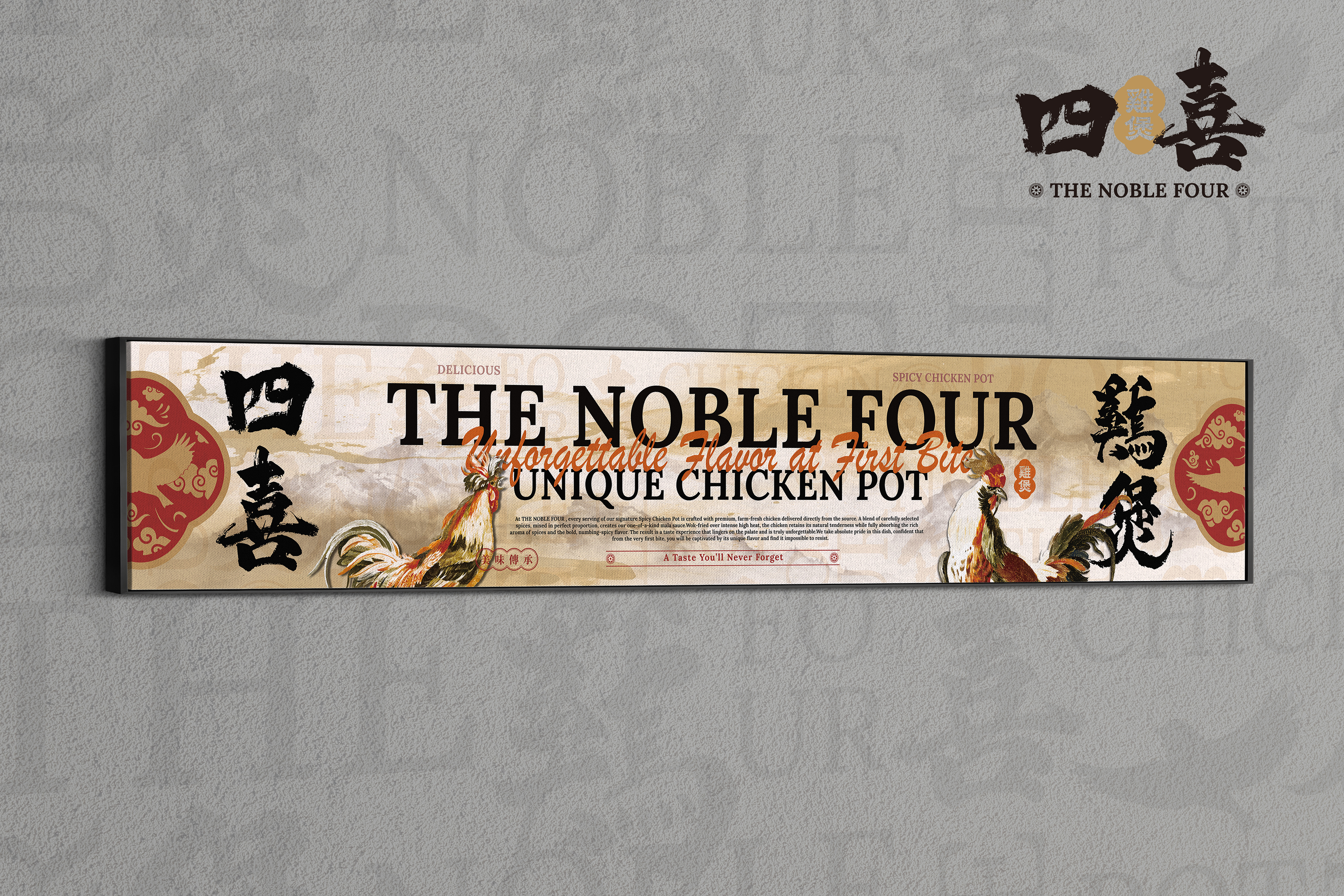
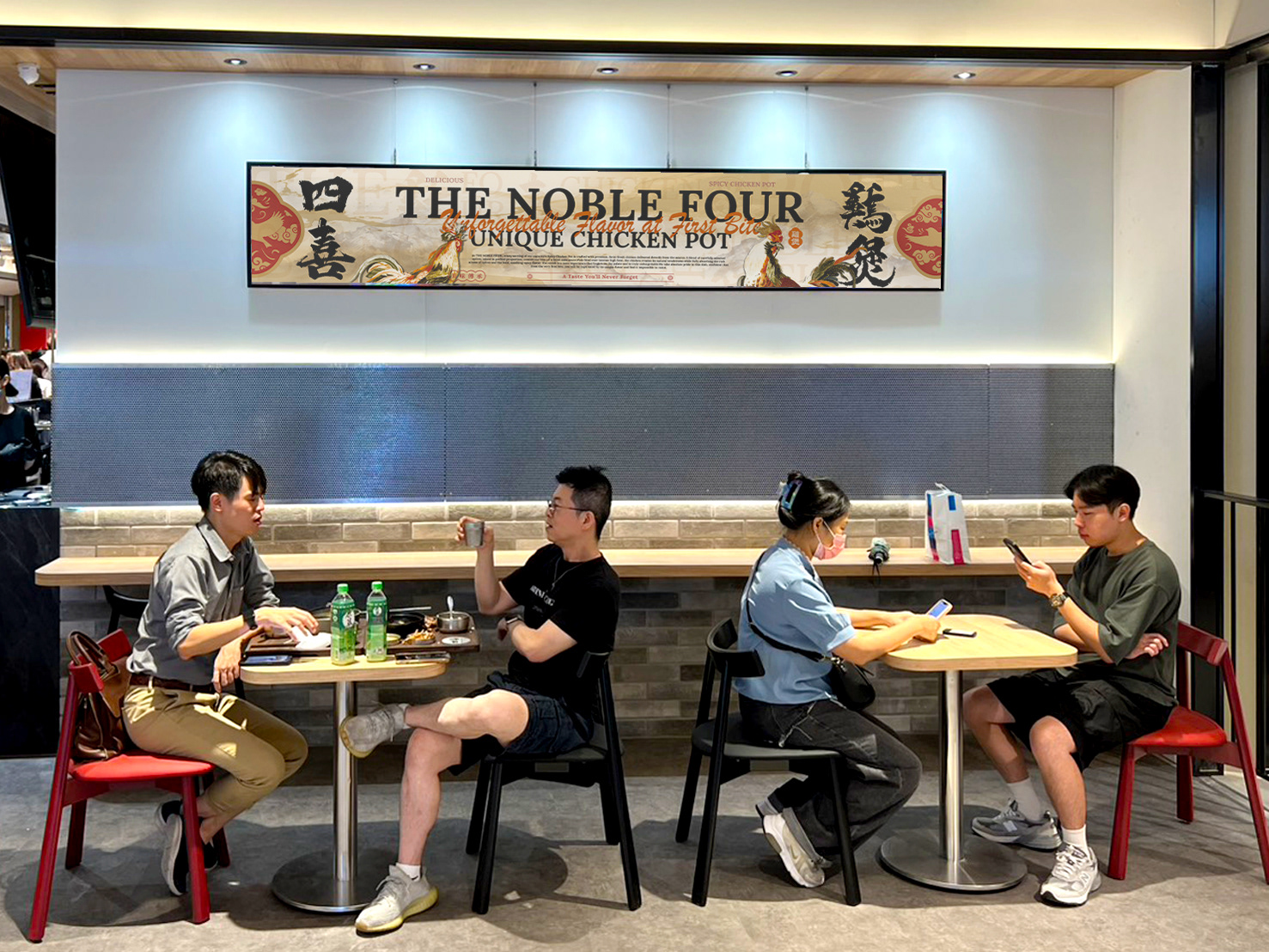
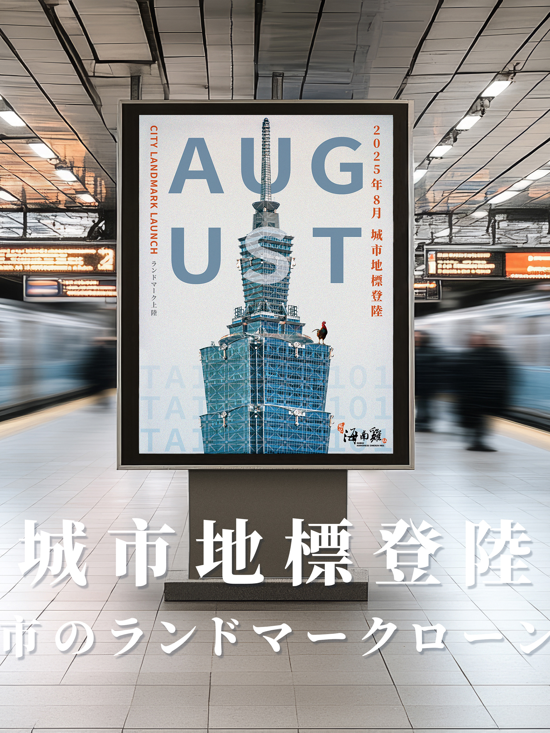
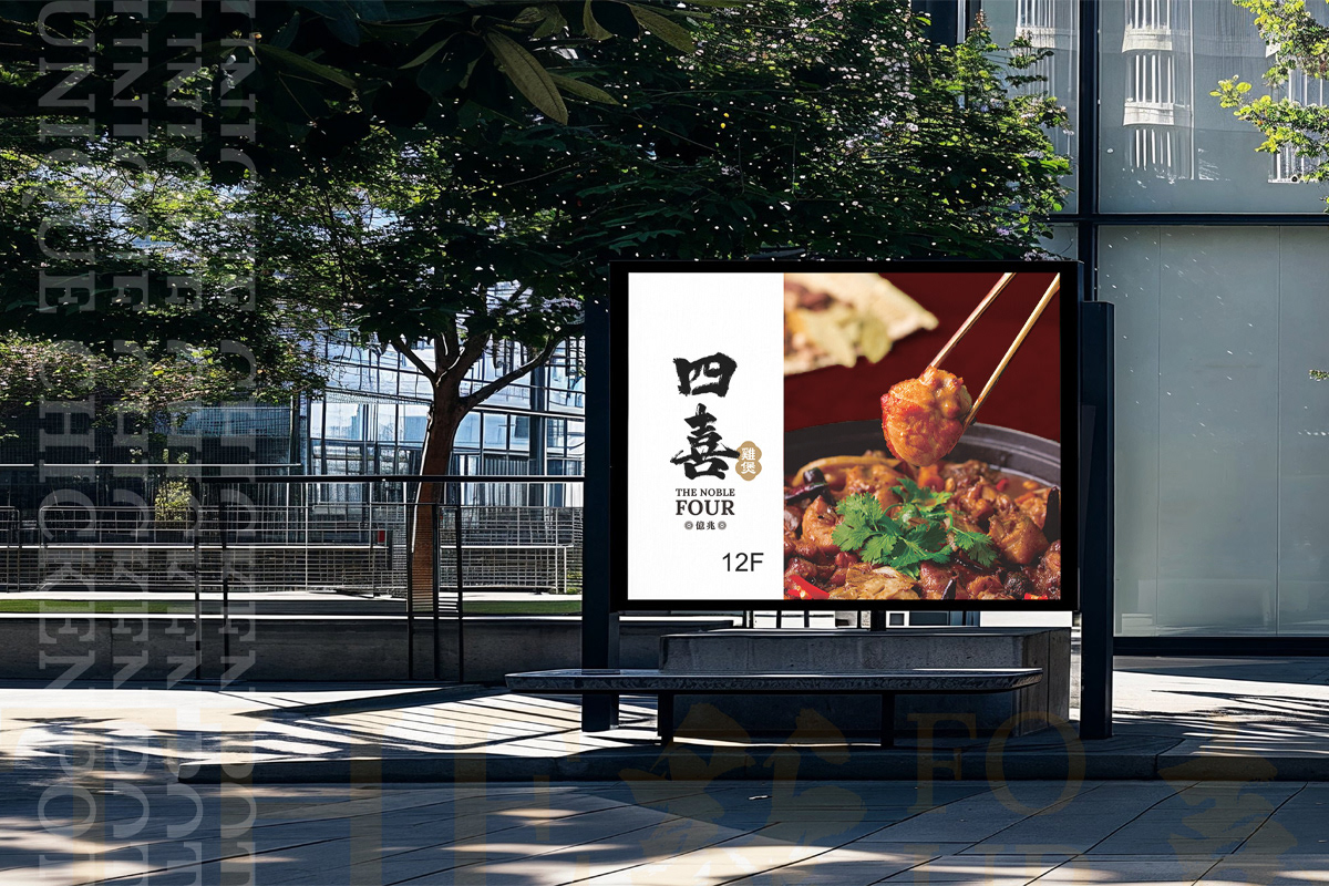
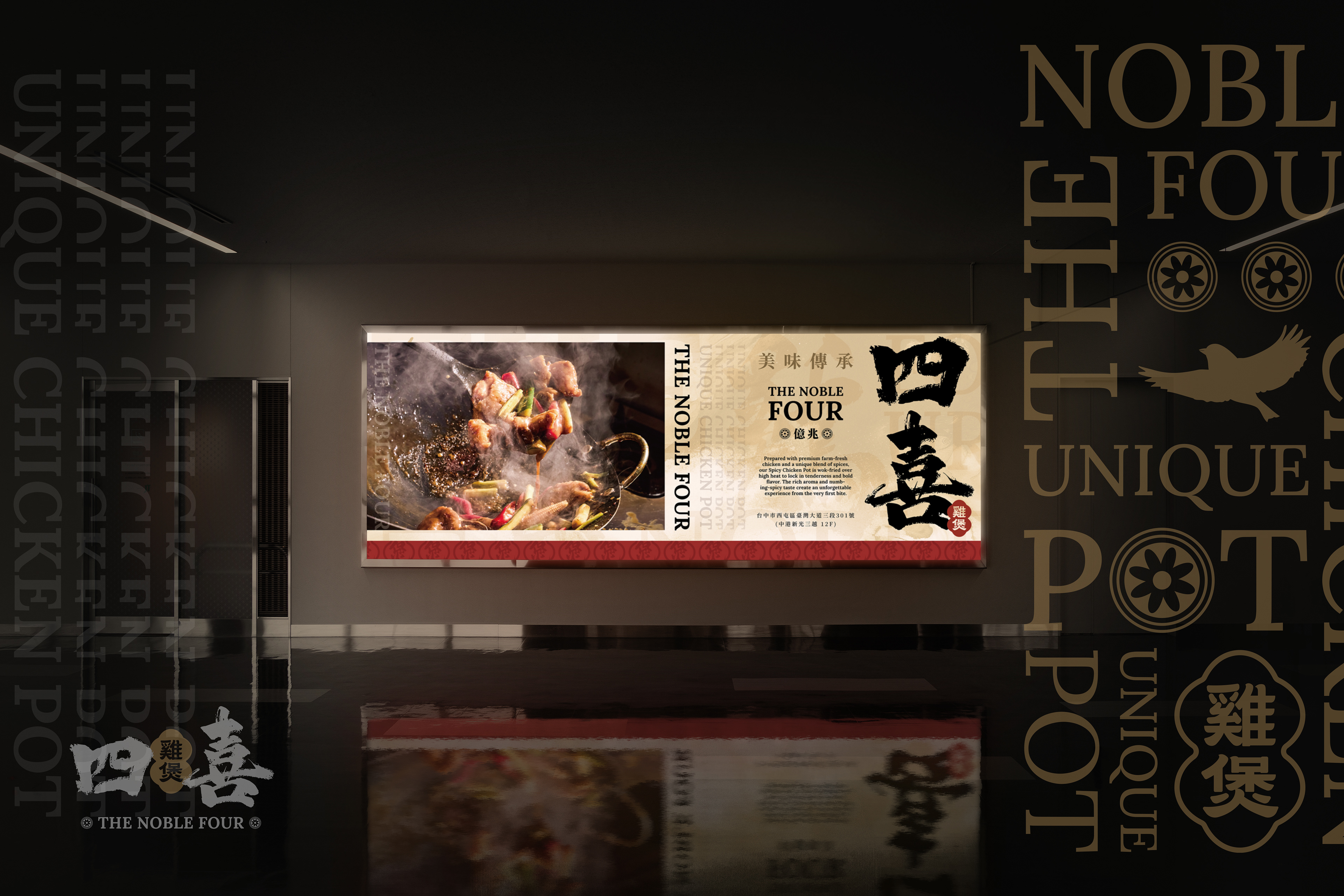
戶外燈箱樓層介紹
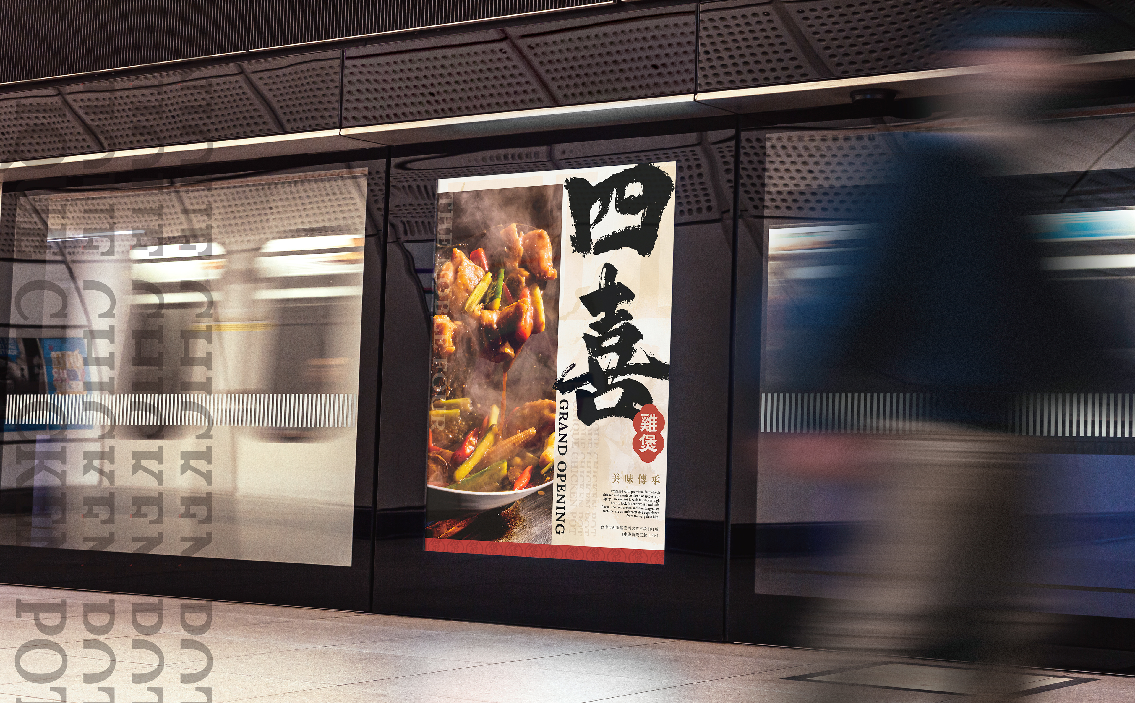
開業海報
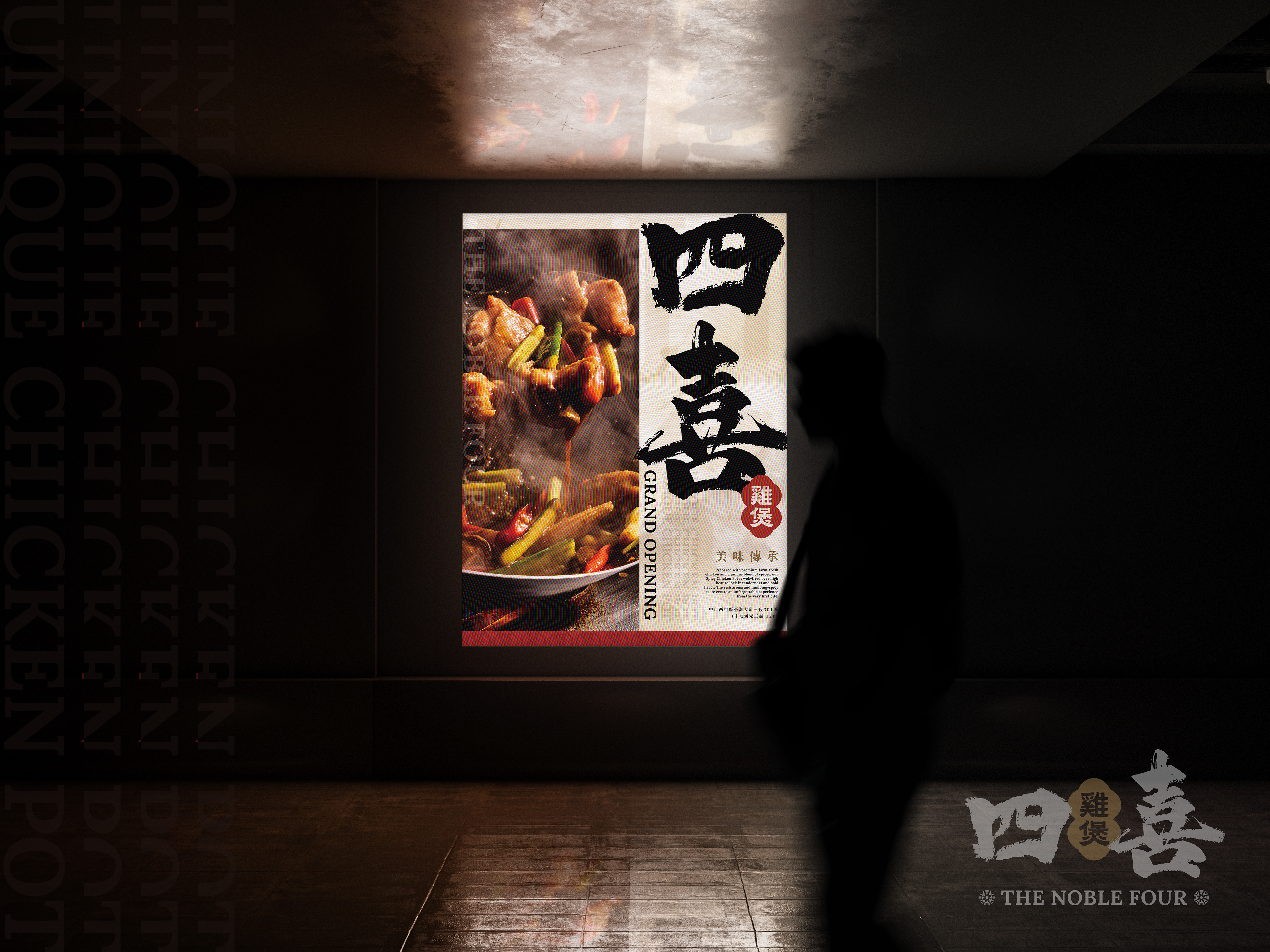
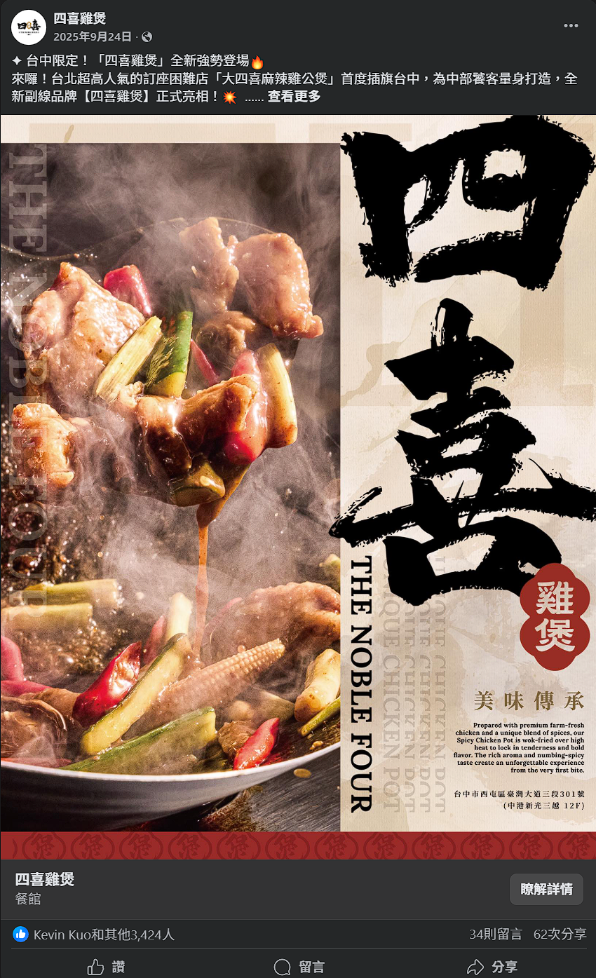
開幕海報以「第一口的記憶」為核心敘事:左側以近距離鍋邊視角捕捉麻辣雞公煲在猛火翻騰瞬間的油光、蒸汽與醬汁拉絲,放大「鍋氣」與食材新鮮度;右側以毛筆重墨落下「四喜」兩字,搭配朱紅圓印「雞煲」點睛,建立新中式的權威感與儀式感。底層鋪以米色宣紙與壓低不透明度的英文字紋(THE NOBLE FOUR / UNIQUE CHICKEN POT)與團壽暗章,形成可呼吸的層次,讓豪邁筆觸與細膩肌理並置,呈現「豪爽與精工」的品牌氣質。標題系統採縱排「THE NOBLE FOUR」呼應中式卷軸閱讀;副題「美味傳承」以端正襯線體壓上淡金色粒紋,語意上承接品牌精神:產地直送的好雞×獨門香料配比×猛火鎖嫩。主視覺→品牌名→口號→英中雙語風味短文→門市資訊的訊息節奏,確保遠望辨識、近看有故事;下緣紅錦連紋作為視覺收邊,將視線導回品牌。整體用色取自品牌錦紅、宣紙米與鎏金微粒,控制對比與留白,既厚重典雅又國際洗鍊;攝影的動態飛濺與字體的靜定垂直形成張力,讓海報在開幕現場、戶外燈箱或社群版位都能即刻抓眼並傳達:四喜雞煲,從第一口開始,記住這一鍋的香與辣。
The opening poster centers on the theme “The Memory of the First Bite.” On the left, a close-up wok-side shot captures the fiery stir-fry of Spicy Chicken Pot—oil gleam, steam, and sauce pulling midair—magnifying freshness and intensity. On the right, bold brushstrokes form the characters “四喜” (The Noble Four), accented by a red circular seal “雞煲”, evoking authority and ceremonial grace in a neo-Chinese aesthetic.
A beige rice-paper base with faint English text (“THE NOBLE FOUR / UNIQUE CHICKEN POT”) and embossed motifs creates breathable layers where bold energy meets refined craftsmanship. The vertical title layout mirrors scroll reading, while the gold-textured subtitle “美味傳承 / Legacy of Flavor” echoes the brand’s essence: premium chicken × secret spice blend × wok-fired perfection.
Information flows from main visual → brand name → tagline → bilingual flavor copy → store details, ensuring distance legibility and close-up storytelling. The lower edge features red brocade patterns framing the design and guiding focus back to the brand.
The palette—crimson, parchment beige, and gilded gold—balances contrast and elegance, achieving both cultural depth and modern polish. The dynamic splash of photography contrasts the vertical calm of typography, giving the poster visual tension and rhythm. Across billboards, store openings, and social media, it delivers one clear message:
THE NOBLE FOUR — From the first bite, the aroma and spice stay unforgettable.
THE NOBLE FOUR — From the first bite, the aroma and spice stay unforgettable.
廣告數據回饋: 高達3400多人按讚,34則留言及62次分享互動。
9/27開幕盛況