Designer: KEVIN KUO / 凱文、YVONNE LIN / 小手川、YUSHI HUANG / 育詩
Design Assistant: CHEN YI / 丞儀
Photographer: 石頭
---
Art Director: YVONNE LIN / 小手川
Design Director: HSIAO YUAN KUO / 郭孝淵
Design Assistant: CHEN YI / 丞儀
Photographer: 石頭
---
Art Director: YVONNE LIN / 小手川
Design Director: HSIAO YUAN KUO / 郭孝淵

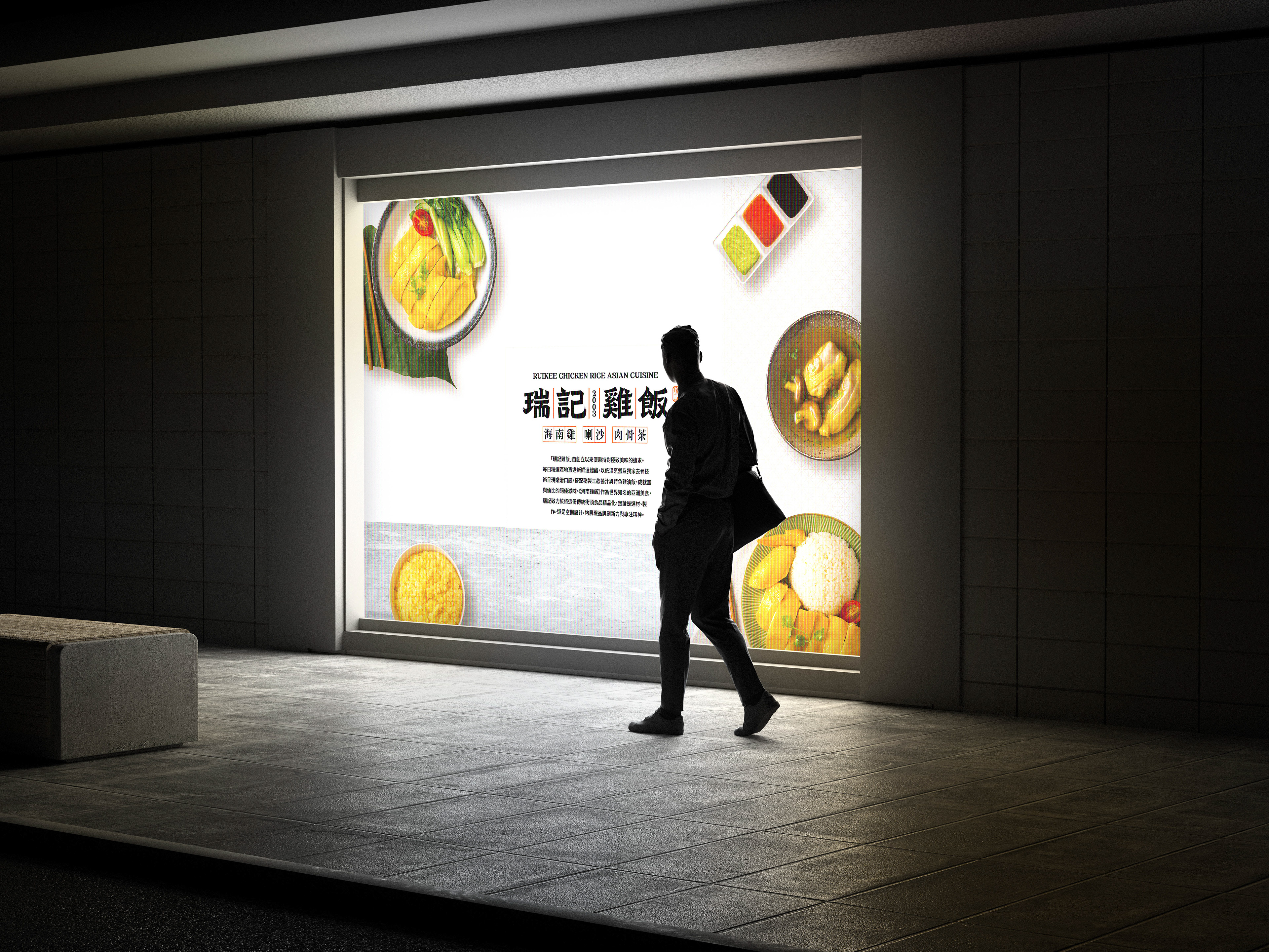
/瑞記海南雞飯-品牌視覺重塑
感謝瑞記的總公司-億兆國際餐飲有限公司的Wallace以及劉老闆的邀約,
協助知名連鎖品牌「瑞記海南雞飯」的品牌重塑專案~正式改名為:「瑞記雞飯」
這次的商標已經優先出現在台北101!
從開幕至今仍大排長龍!!!

設計理念:
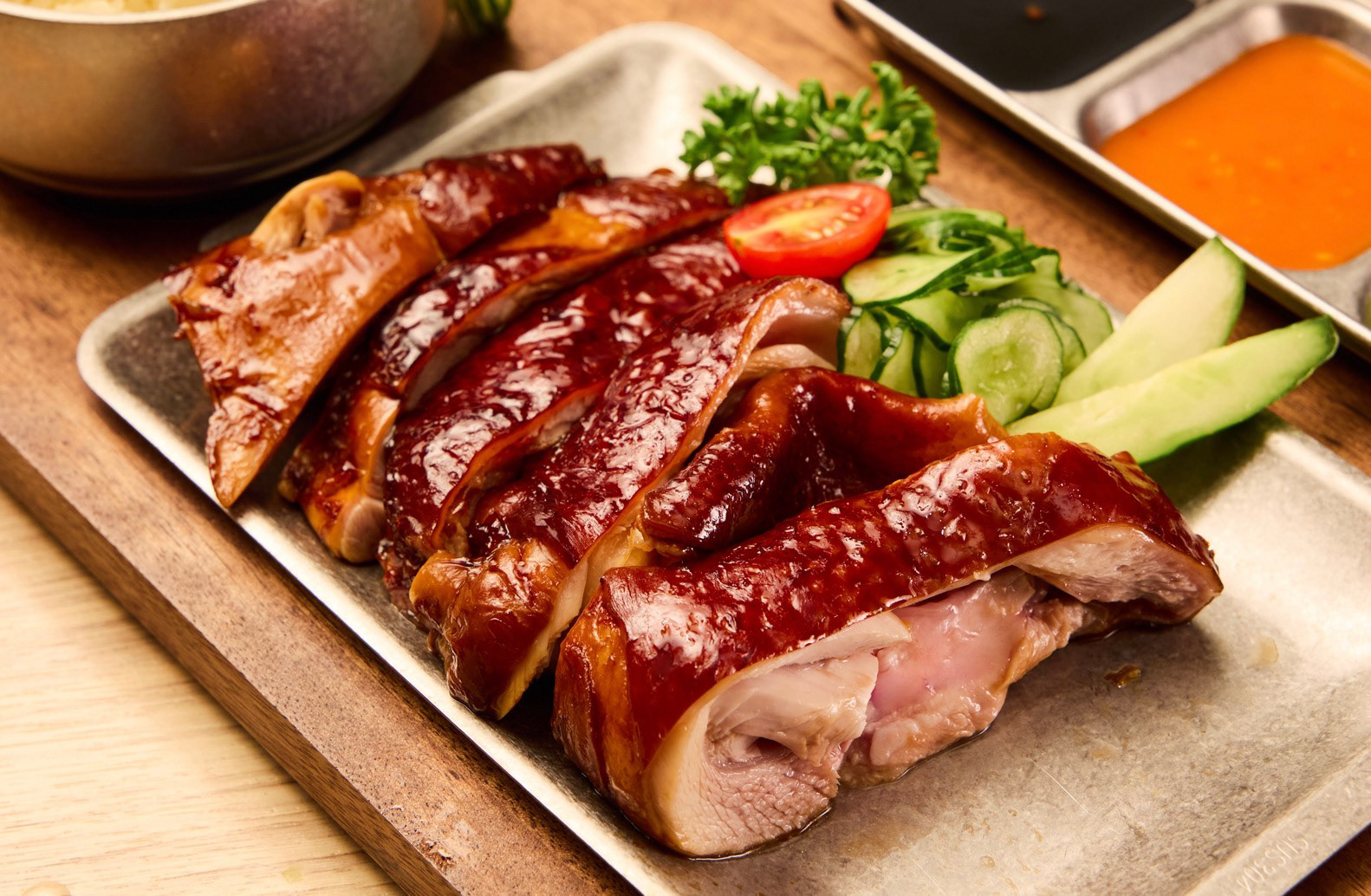
這款《瑞記雞飯》LOGO,以「經典中帶現代、簡約中見故事」為核心,融合新加坡南洋市集的中式招牌風格,結合東南亞料理的文化底蘊,不僅是一個標誌,更是一段可細細品讀的南洋味覺史。
主體字由「瑞記雞飯」貫穿,採用燈箱格框設計,致敬早期華人商號招牌;中央的「2008」則標記品牌創立年份,象徵這份味道歷經時間淬鍊、屹立不搖。
配色靈感來自品牌經典醬料:橘紅色象徵辣醬的熱情,強化「樸實但用心」的品牌精神。
「瑞記」也向雞飯原型創始人莫履瑞致敬,串起新加坡海南雞飯的歷史脈絡。整體設計如同一碗雞飯——看似簡單,實則講究,用一塊招牌,講好一道菜、一段歷史、一份來自南洋的真誠款待。
-----
-----
Design Concept:
The logo for Ruikee Chicken Rice centers on the philosophy of “modernity within tradition, stories within simplicity.” Inspired by the classic Chinese signage style found in Singaporean Southeast Asian markets, it embodies the rich culinary heritage of the region. More than a logo, it is a visual narrative of Southeast Asian flavors.
The logo for Ruikee Chicken Rice centers on the philosophy of “modernity within tradition, stories within simplicity.” Inspired by the classic Chinese signage style found in Singaporean Southeast Asian markets, it embodies the rich culinary heritage of the region. More than a logo, it is a visual narrative of Southeast Asian flavors.
The main logotype, “瑞記雞飯,” is set within a lightbox-style grid, paying tribute to the vintage storefront signs of early Chinese merchants. The central “2008” marks the brand’s founding year, symbolizing a flavor that has stood the test of time.
Its color palette draws from Ruikee’s signature sauces—particularly the vibrant orange-red of chili sauce—evoking the passion and sincerity behind every dish. It reinforces the brand spirit: humble yet crafted with care.
The name “Ruikee” also honors Mok Luey Rui, the originator of Hainanese chicken rice, linking the brand to the roots of this iconic dish. Like the dish itself—simple in appearance, rich in substance—the logo encapsulates a story, a legacy, and a heartfelt welcome from the heart of Southeast Asia.


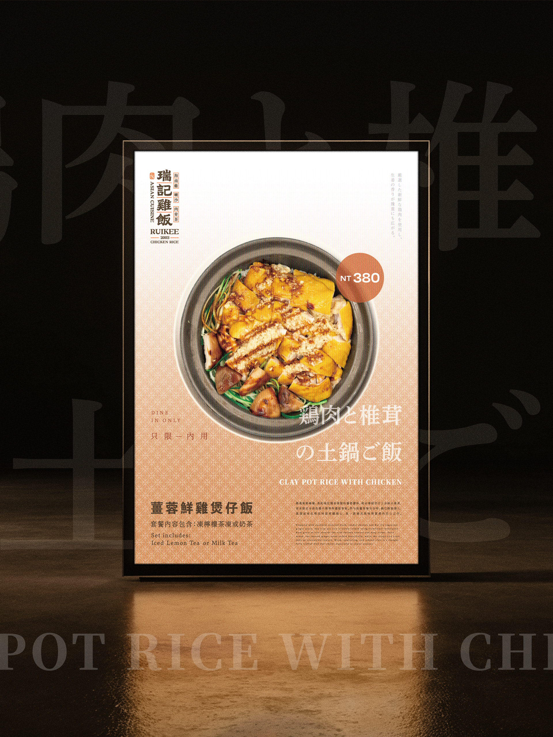
MENU DESIGN


為了更好呈現套餐及質感,特地用胡桃木做雷射切割專屬托盤

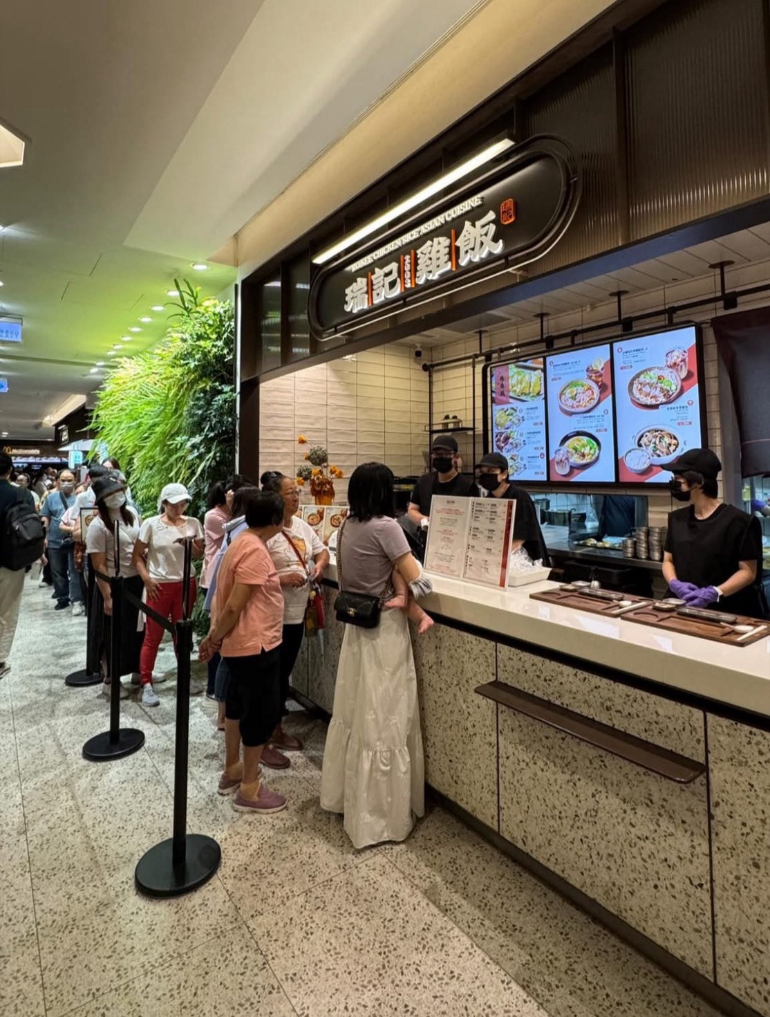
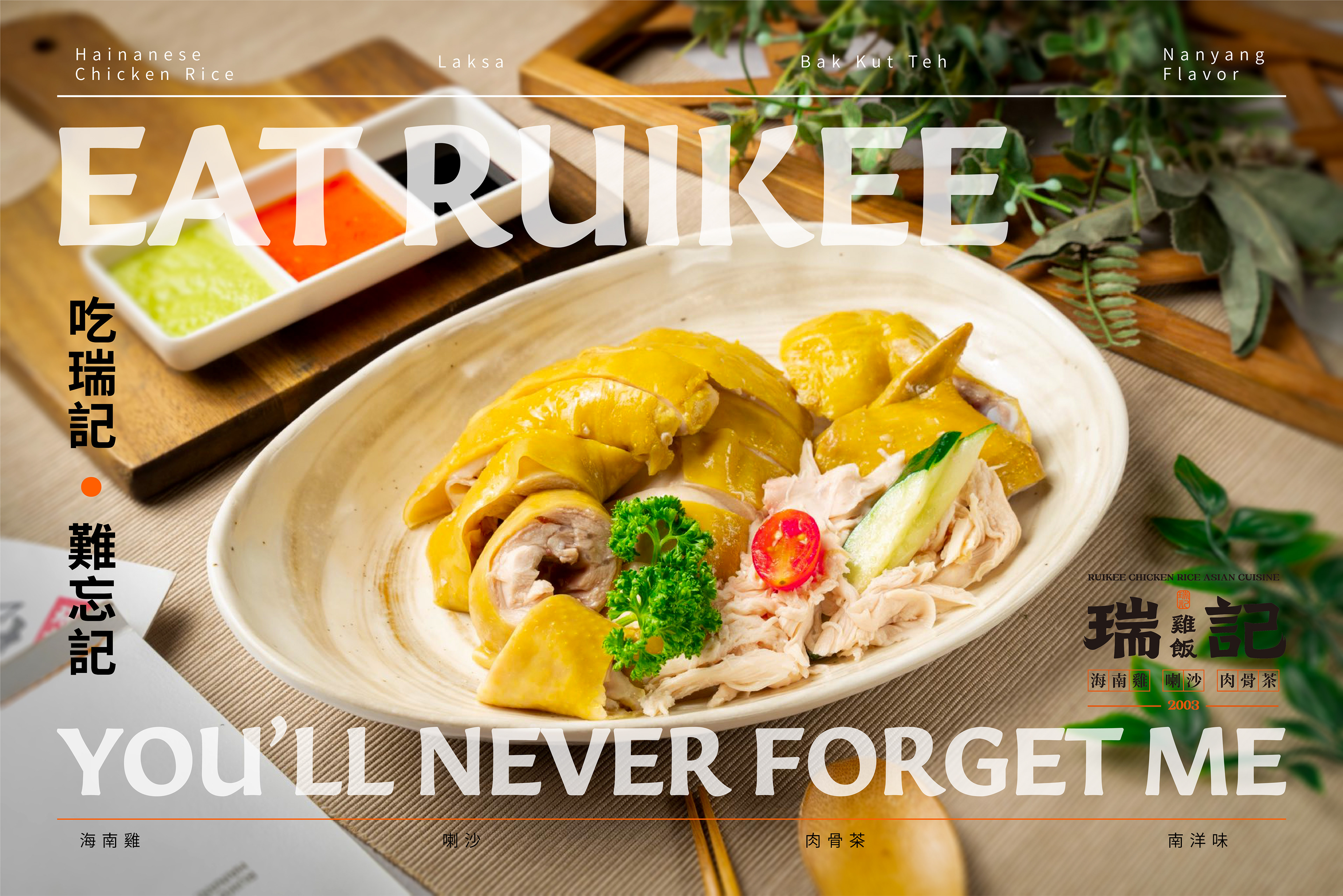
新視覺及101店面開幕至今仍大排長龍
開幕海報