DESIGNER: HSIAO YUAN KUO
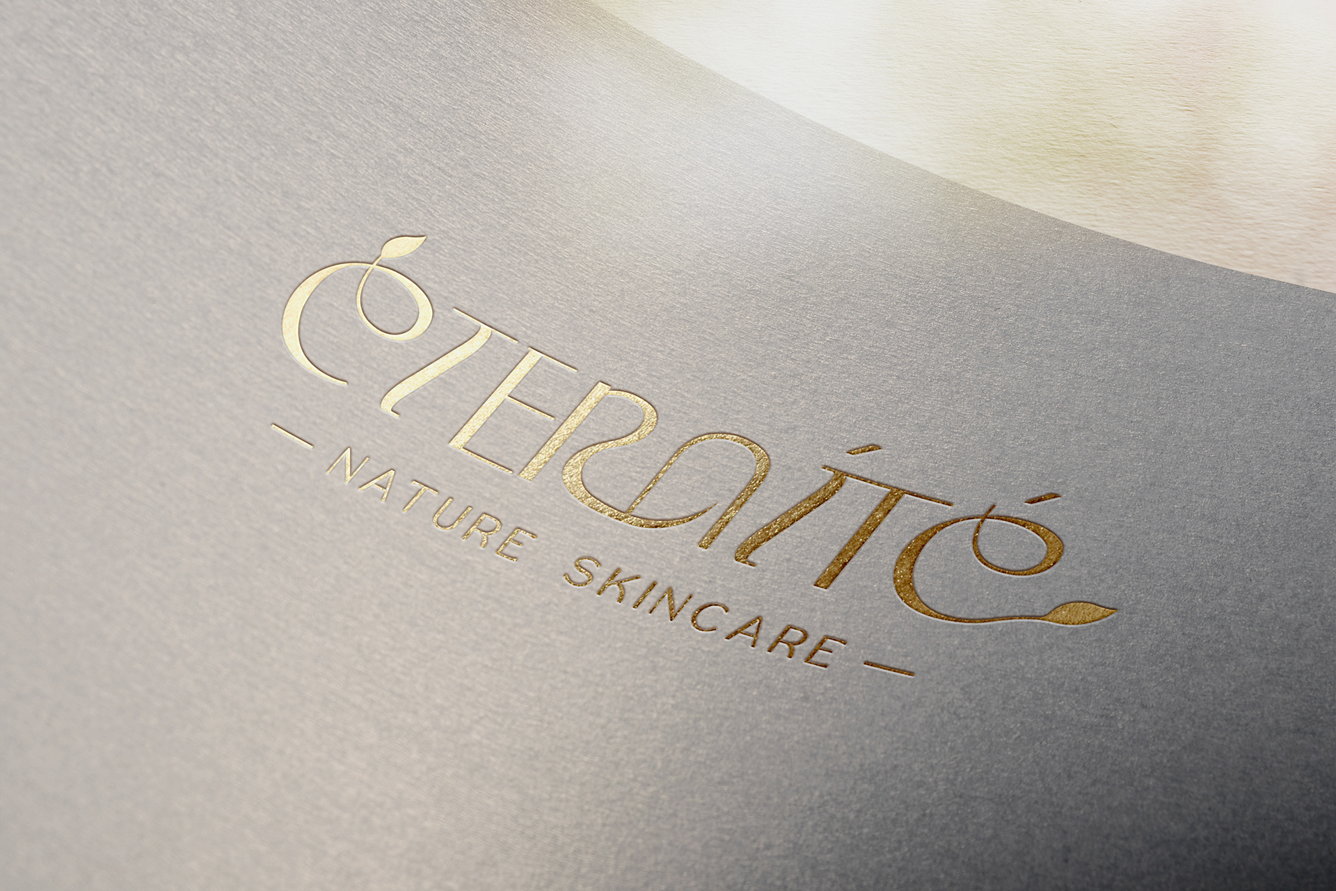
ÉTERNITÉ - NATURE SKINCARE
/設計理念:
此LOGO的設計靈感來自於品牌核心技術和原料,主要是多種天然新芽和植物油萃取。
此LOGO的設計靈感來自於品牌核心技術和原料,主要是多種天然新芽和植物油萃取。
LOGO採用現代裝飾風格,既高雅又有質感,符合歐美保養品和化妝品品牌的設計趨勢:
/E上面的一撇:用草本植物和嫩芽的感覺裝飾,象徵著品牌產品的天然和生機。
/字體設計:整體字體設計運用了攀藤植物和薔薇科植物的特性進行纏繞設計,每個字體都有粗細不一的變化,象徵品牌的可塑性,能夠適應各種群體、文化和臉部特性,提供最佳的護膚體驗。
/R與N的設計:R與N的設計形成如拱門般的視覺效果,象徵著使用此品牌的客戶不僅能獲得最天然的煥膚體驗,更能開啟通往永保青春的成功之門。LOGO採用現代裝飾風格,既高雅又有質感,符合歐美保養品和化妝品品牌的設計趨勢。同時突顯品牌在歐美保養品和化妝品市場中的地位,傳達出品牌對自然和美的追求,及其在護膚領域的專業和卓越。
/e的尾巴連接葉子:代表品牌從頭到尾都崇尚自然和環保。
/e的尾巴連接葉子:代表品牌從頭到尾都崇尚自然和環保。
通過這些設計元素,LOGO傳達了品牌對自然、健康和美麗的追求,用最天然、最精華的保養液來復甦、保養、重喚你的青春美麗,達到永保青春、自然美麗的效果。
The inspiration for this logo design comes from the brand's core technology and ingredients, which primarily involve various natural buds and plant oil extracts.
The logo adopts a modern decorative style that is both elegant and textured, aligning with the design trends of European and American skincare and cosmetic brands:
/The stroke above the "E": Decorated with elements resembling herbs and young sprouts, symbolizing the brand’s natural and vibrant products.
/Font Design: The overall font design incorporates the characteristics of climbing plants and Rosaceae family plants, with each letter exhibiting varying thicknesses. This symbolizes the brand’s versatility, capable of adapting to various demographics, cultures, and facial features, offering the best skincare experience.
/The design of "R" and "N": The design of "R" and "N" forms a visual effect similar to an archway, symbolizing that customers using this brand not only experience the most natural rejuvenation but also unlock the door to eternal youth. The logo adopts a modern decorative style that is both elegant and textured, aligning with the design trends of European and American skincare and cosmetic brands. At the same time, it highlights the brand's position in the European and American skincare and cosmetics market, conveying the brand's pursuit of nature and beauty, as well as its professionalism and excellence in the skincare field.
/The tail of "e" connected to a leaf: Represents the brand's commitment to nature and environmental sustainability from beginning to end.
Through these design elements, the logo conveys the brand’s dedication to nature, health, and beauty. It aims to rejuvenate, nurture, and restore your youthful beauty using the most natural and essential skincare formulas, achieving eternal youth and natural beauty
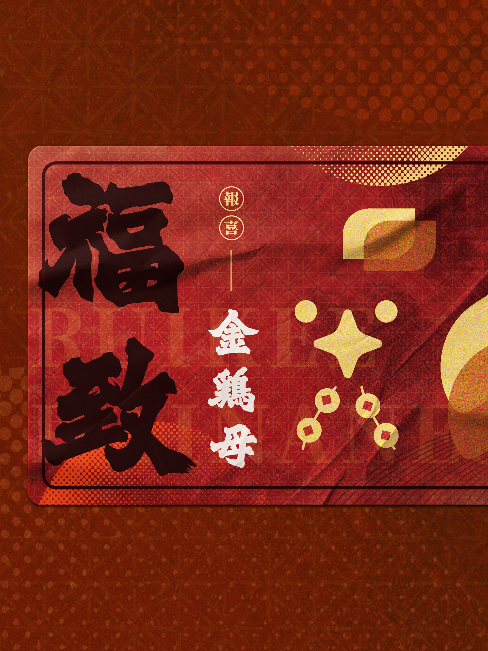
GOLD STAMPING