
DESIGNER: Hsiao Yuan Kuo/郭孝淵

/AIFULI - 艾芙麗衛生棉包裝系列
很高興受到艾芙麗品牌負責人 - GARY 的邀請,
希望我們能為該品牌經期褲重新改版視覺並且做出與現今市面不同的視覺樣式,同時加大客戶年齡層的購買意願!
/AIFULI – Aifuli Sanitary Pad Packaging Series
We’re honored to be invited by GARY, the brand director of AIFULI,
to collaborate on redesigning the visual identity for their period underwear line.
to collaborate on redesigning the visual identity for their period underwear line.
Our goal is to create a unique visual style that stands out from existing products on the market, while also expanding its appeal across a wider age range of customers and enhancing purchase intention.

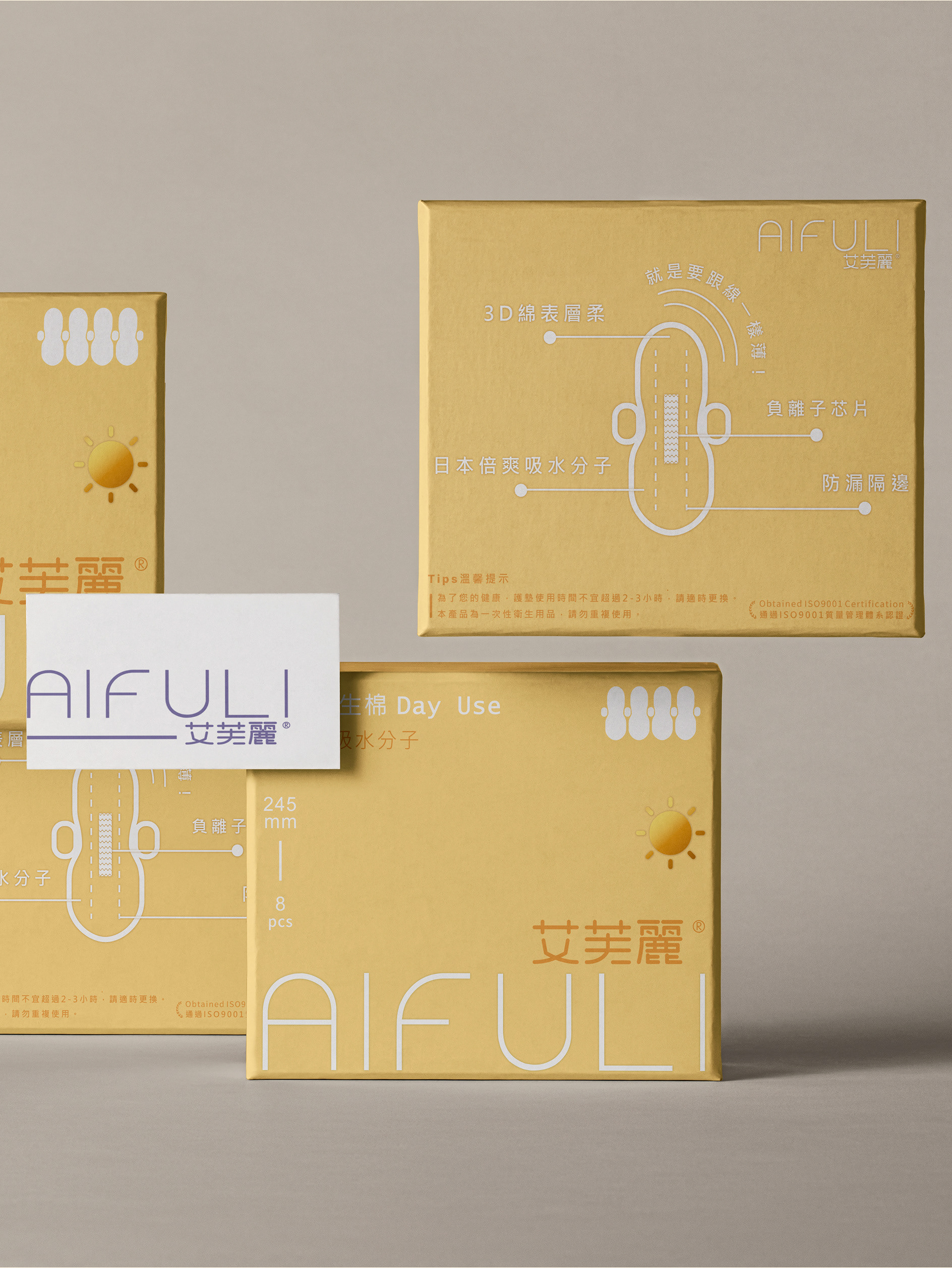
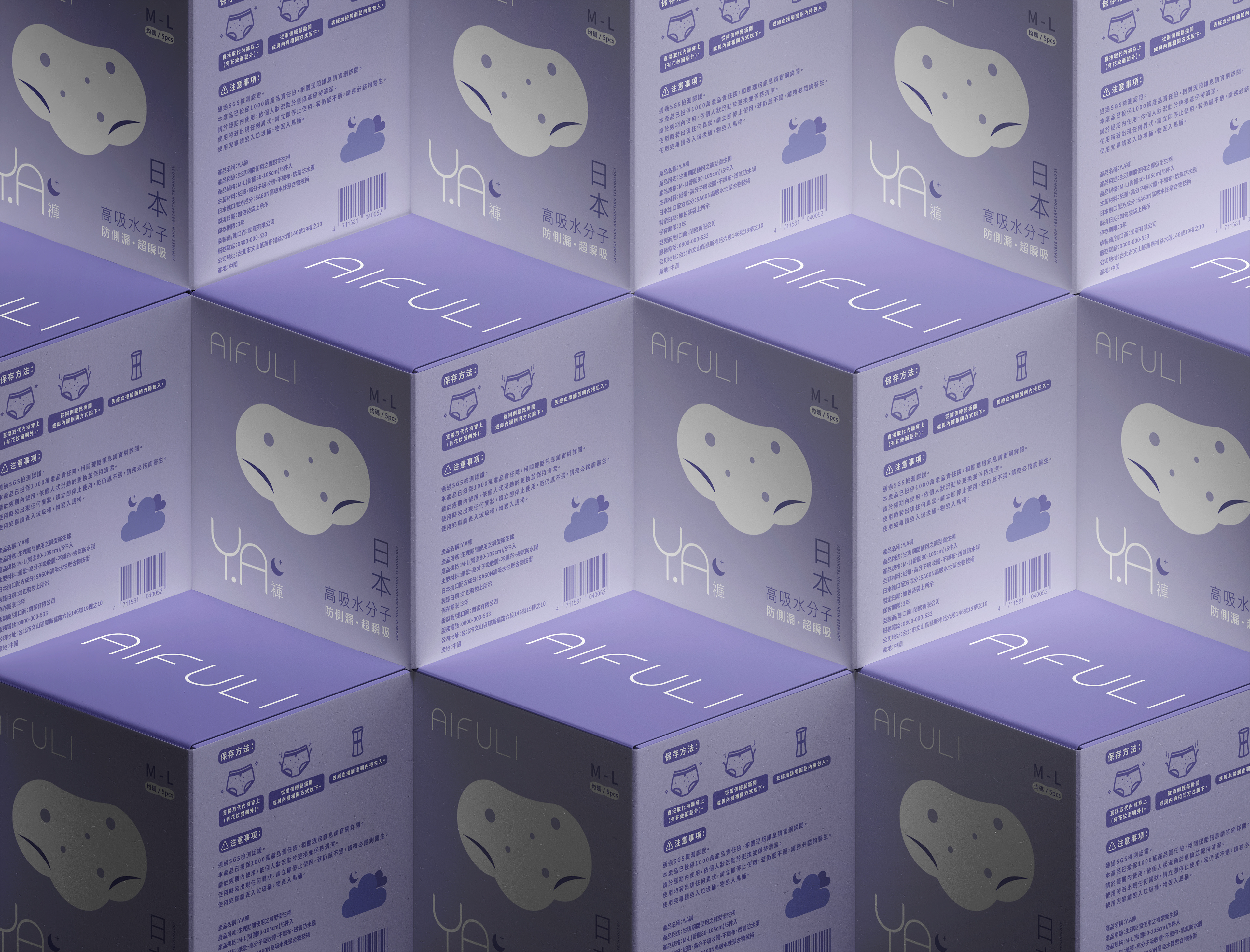
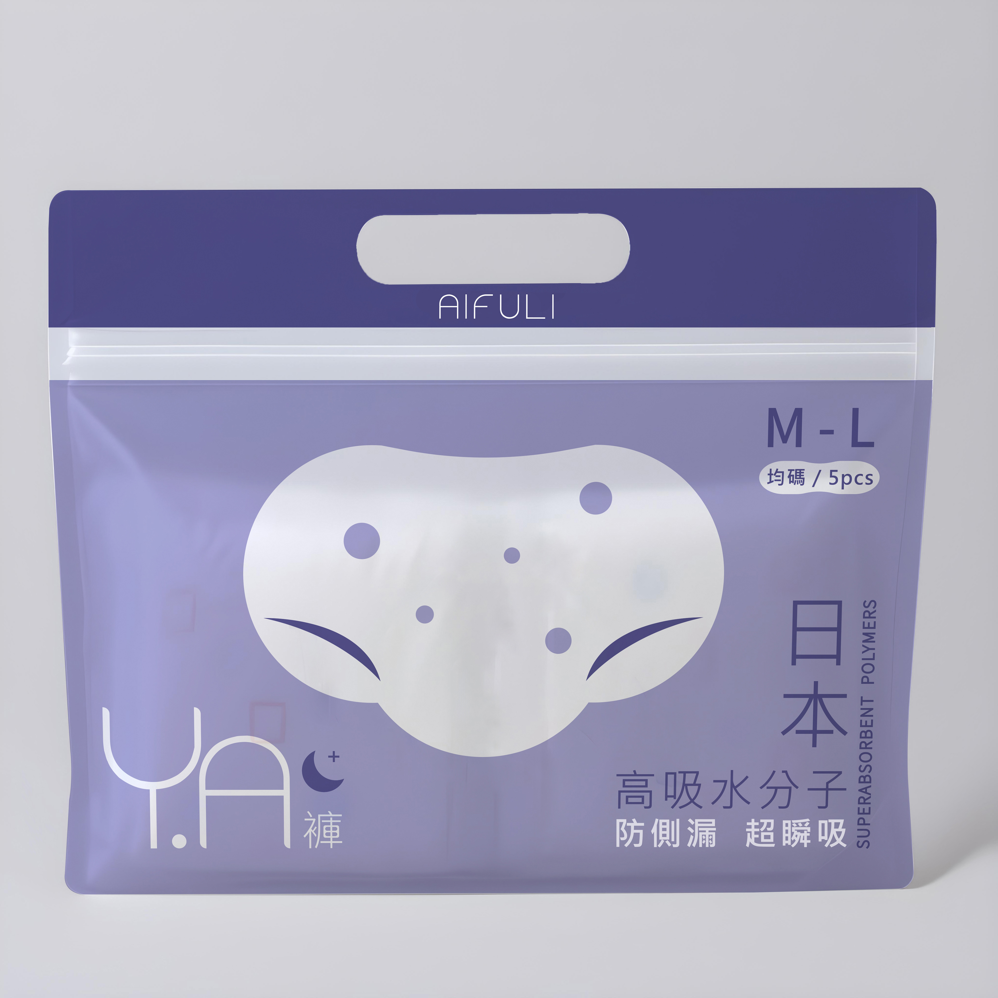
設計理念:
此包裝延續艾芙莉一貫的馬卡龍色調,並結合夜用加長型衛生棉的功能聯想,打造出現代簡約、隱私與質感兼具的設計語言,貼近每位女性經期時的真實需求。
/品牌識別強化:
✦ 主視覺圖像以「如棉花般的柔軟舒適」為靈感,結合女性經期期間常見的肌膚、心理不適感(如冒痘、情緒...等),與實際 Y.A 褲上的花紋進行轉譯,設計出療癒又具情境連結的主視覺,突破以往傳統設計容易讓人聯想到尿布或內褲的尷尬感,提升整體市場視覺吸引力與辨識度。
✦ 搭配雲朵+月亮符號,延伸「舒適安睡」的品牌記憶點,傳遞陪伴經期每一夜的溫柔意象。
✦ LOGO以艾芙莉品牌黑體字結合「Y.A 褲」整合設計,營造直覺、清晰且一致的視覺識別,鞏固品牌印象。
✦ 色彩選用薰衣草紫與紫羅蘭雙色系,創造高雅對比與時尚層次感,傳達安心、溫柔、但不失個性的品牌語言。
/直覺圖示設計:
✦ 背面設計採用簡潔ICON引導操作,清楚說明穿戴步驟與建議時機,降低文字閱讀負擔。
✦ 視覺化訊息傳遞,讓首次使用者也能輕鬆理解、快速上手。
溫柔設計,為經期而生從視覺到功能,每一個細節都為女性量身打造。艾芙莉Y.A 褲不只兼具時尚與實用,更用貼心的包裝設計,讓「那些日子」也能自在、優雅、不被打擾。
We are honored to be invited by GARY, the brand director of AIFULI,
to refresh the visual design for their period underwear.Our goal is to create a look that stands apart from existing products on the market,while expanding appeal across a broader age range of customers.
to refresh the visual design for their period underwear.Our goal is to create a look that stands apart from existing products on the market,while expanding appeal across a broader age range of customers.
/Design Concept:
This packaging continues AIFULI’s signature macaron color palette,blending it with visual cues inspired by the functionality of overnight extended sanitary pads.The result is a modern, minimalist design language that balances discretion with a refined texture,attuned to the real needs of women during their menstrual cycle.
This packaging continues AIFULI’s signature macaron color palette,blending it with visual cues inspired by the functionality of overnight extended sanitary pads.The result is a modern, minimalist design language that balances discretion with a refined texture,attuned to the real needs of women during their menstrual cycle.
/Brand Identity Reinforcement:
✦ The key visual is inspired by the softness of cotton,
interpreted through the lens of common physical and emotional experiences during menstruation—
such as skin breakouts and mood swings—blended with actual patterns found on the Y.A underwear.
This creates a soothing and emotionally resonant graphic, breaking away from the traditional
"diaper-like" or "underwear-resembling" imagery and enhancing visual appeal and market recognition.
✦ Paired with icons of clouds and moons, the design extends a sense of "comfortable sleep,"strengthening brand memory and conveying a gentle presence throughout each night of the menstrual period.
✦ The logo merges AIFULI’s bold sans-serif brand type with the "Y.A Pants" identity,forming a clean, intuitive, and unified visual mark that reinforces brand impression.
✦ A color scheme of lavender and violet creates an elegant contrast with layered sophistication,delivering a message of calmness, gentleness, and personality.
/Intuitive Icon Design:
✦ The back panel features a minimal icon-based layout that clearly illustrates how to wear the product and when to use it,minimizing the need for lengthy text descriptions.
✦ Visual information delivery ensures that even first-time users can quickly understand and easily get started.
/Gentle Design, Made for Periods
From visuals to functionality, every detail is tailored for women.The AIFULI Y.A Pants are not only stylish and practical,
but thoughtfully packaged to ensure that “those days” can be met with comfort, elegance, and peace of mind.
From visuals to functionality, every detail is tailored for women.The AIFULI Y.A Pants are not only stylish and practical,
but thoughtfully packaged to ensure that “those days” can be met with comfort, elegance, and peace of mind.
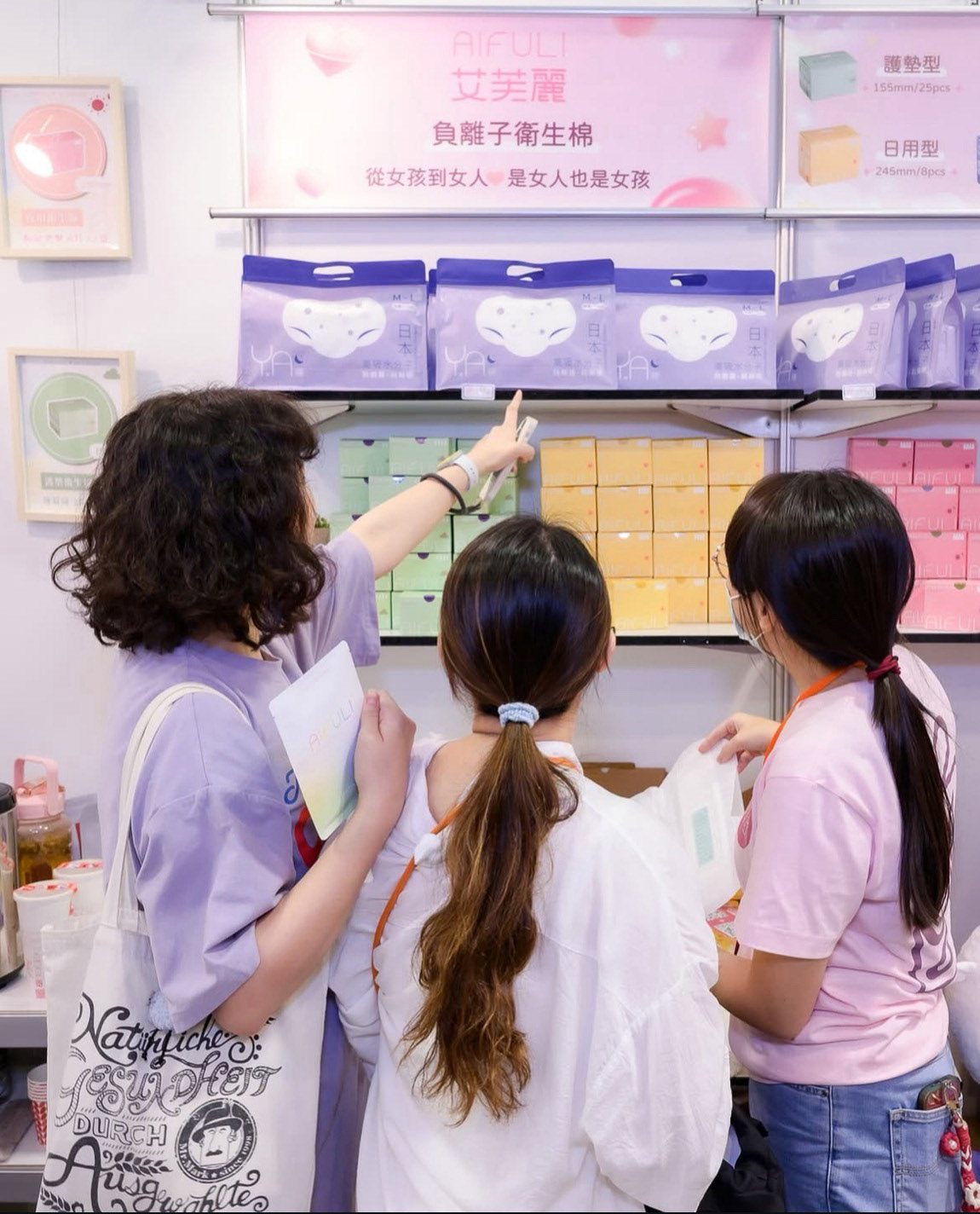
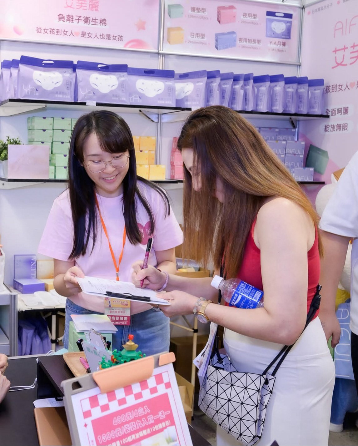
袋裝樣式
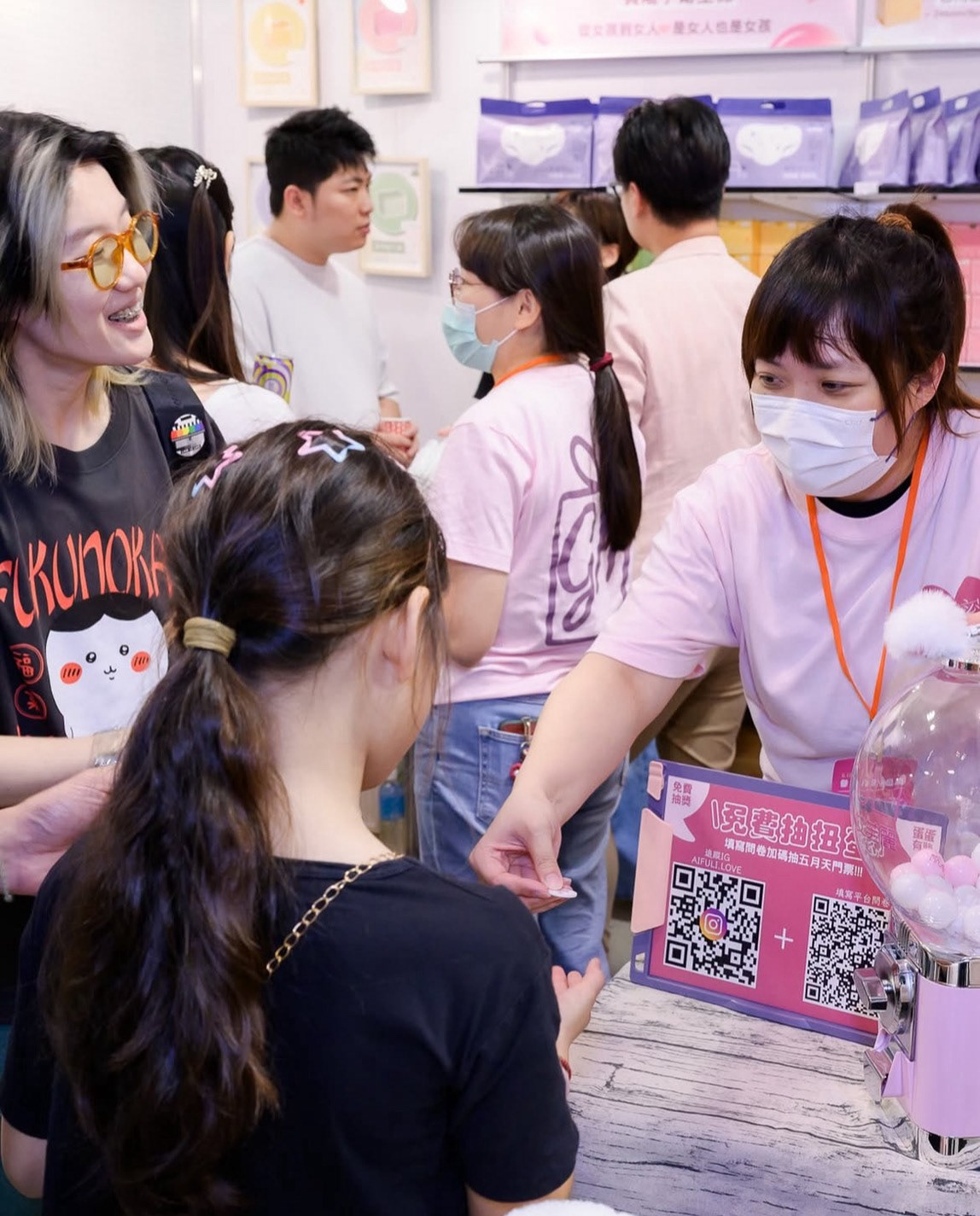
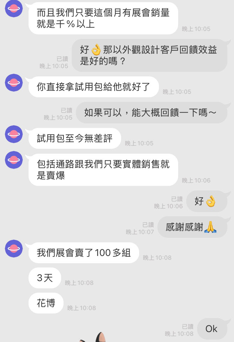
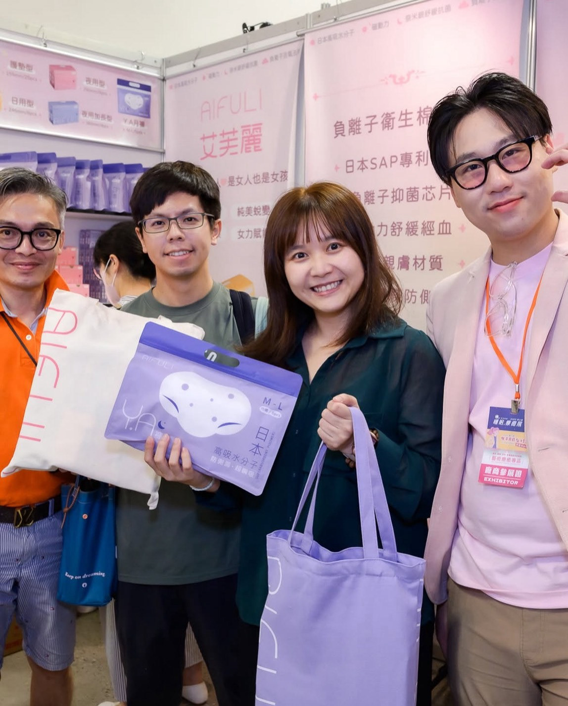
真實回饋及效益
ㄏㄨㄚ